BPA Logo Design
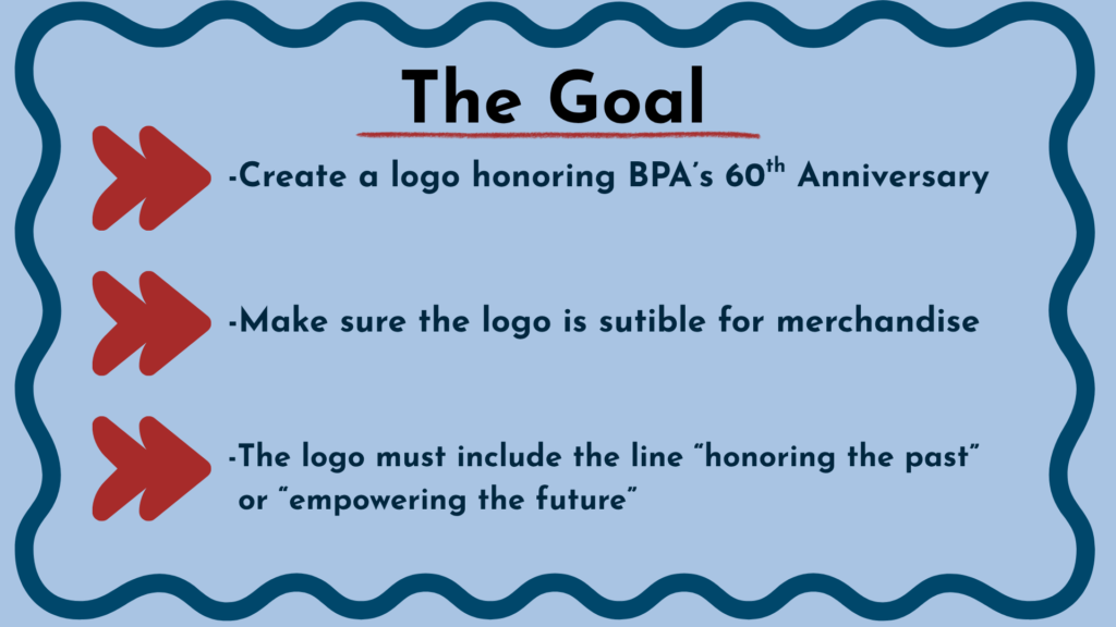
My job was to create a logo for the 60th anniversary of Business Professionals of America. I had 30 hours to sketch, refine, and place together my final design. I started by reading the rules and guidelines. Its stated that I had include “60th anniversary” and “empowering the future” or “honoring the past”. I began with looking up inspiration for how i wanted my logo to look.
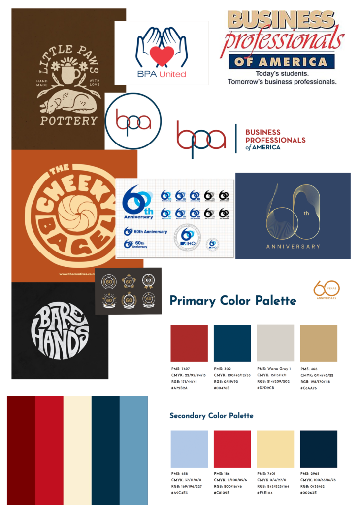
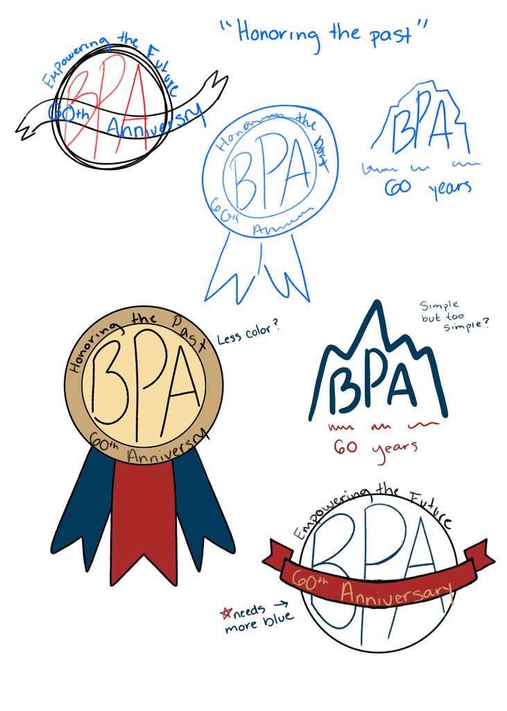
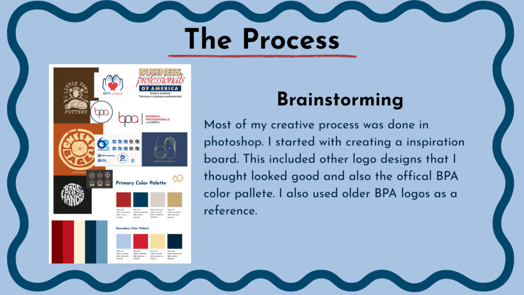
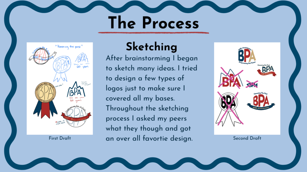
I know that I wanted a logo that was close to the official logo but had some flair added. I went to the Bpa website and found the handbook, that gave me the official color pallets and typography. Once I had a base to work off of I sketched up some designs. I -though i had wanted to go with a ribbon/badge design but nothing I sketched up seemed to feel right. I asked my crew team what they though and the banner design was the overall fan favorite.
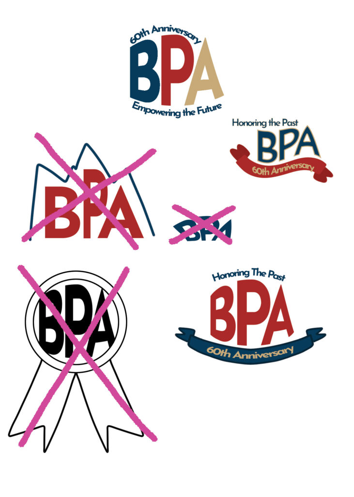
I did some more brainstorming with the banner idea. They all felt good but none felt like enough. I asked my crew team again but ended up with split answers this time! I took creative liberty and mocked up even more designs based off of the critiques I received and came up with these two final designs.
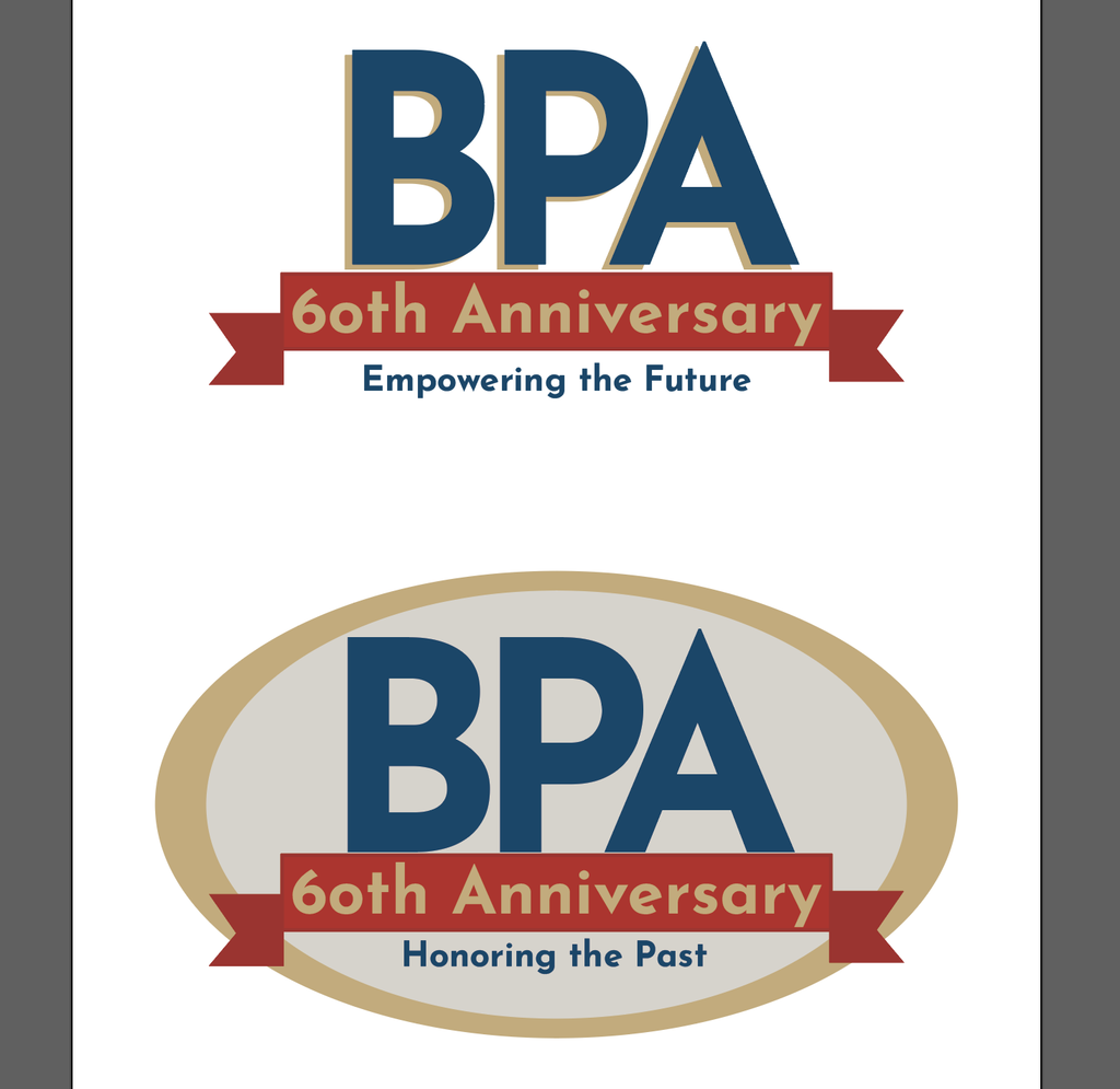
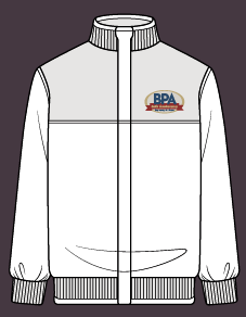
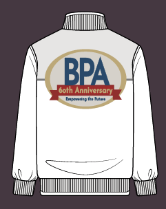
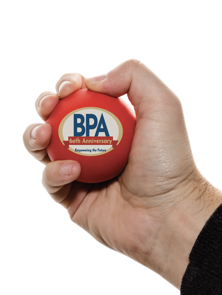
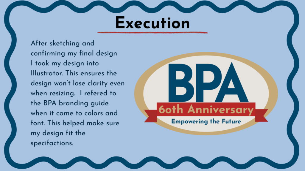
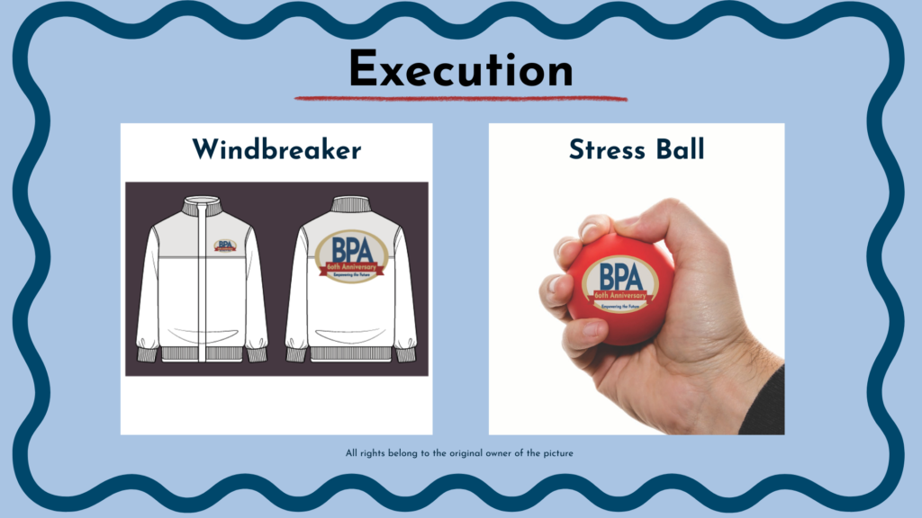
After the final check with my crew team, I landed on the bottom design but with “empowering the future”. I took my final design into Illustrator and created my mock-ups as well. The guidelines state that you must place your design on a windbreaker and stress ball mock-up.