Skills Showcase Projects

Project Brief :

Your team has been hired to design promotional components for a new up and coming movie that has been designated as G or PG-13. The team must create a minimum of 4 items, and one must include the Movie DVD Case (Front, Spine, & Back). Other items could include: Store Movie Poster, Characters, Movie Trailer, Social Media Ad Campaign, Swag, etc.

Plot Synopsis:

Karma Back on Jupiter is a PG-13 mystery film created by:
-Isabel Cárdenas Orozco
-Mariah Harrison
-Kadee Hantke

In the quaint town of Guthrie, the seemingly idyllic friendship among three girls- Jupiter, Kaci, and Yuna- masks a brewing storm beneath the surface. At first glance, the town appears picture-perfect, as does their friendship, but lurking beneath the facade lies a tangled web of secrets and betrayals. Suddenly, Jupiter vanishes without a trace, pushing Yuna and Kaci into a desperate search for answers.

As they delve deeper into the mystery, Kaci grapples with a gnawing suspicion that her own internal conflicts might be linked to Jupiter’s disappearance. Clues left behind by Jupiter puzzle the duo, leading them to uncover a trail of deceit and betrayal that hints at a much bigger and more sinister force at play. With each revelation, they confront the possibility that the perfect facade of their town and friendship might be a carefully constructed illusion, masking a darker truth.

As the girls race against time to unravel the mystery, the lines blur between friend and foe, leaving them to question whether Jupiter’s vanishing act was an act of vengeance or a consequence of the dark undercurrents simmering within their seemingly harmonious relationship. With each piece of the puzzle, they come closer to the chilling realization that some secrets are best left buried, and that the price of unraveling the truth might be more than they bargained for. Will they be able to find Jupiter, or was karma getting her back inevitable?

Team Brainstorming & Goal Documentation :

Initial Iteration(s) of Karma Back On Jupiter Concept
Brainstorming:

We knew that going into our brainstorming session that we wanted to create a film using mixed/multimedia avenues. This would mean potentially conducting live action filming, and then mixing those live action elements with animated elements in the production process. This would allow us to create a trailer with different elements that we will be able to use across the rest of the project’s tasks (ads, merch, movie posters).

We ultimately chose a more PG-13 mystery genre concept for our trailer. This led us to come up with a brief plot synopsis and idea that will direct us for the trailer; the movie will take place in an old small town where a person in a friend group has gone missing. The trailer will hint at what route the friends will be taking to solve the mystery, and possible clues they may use to find their friend. Additionally, there will be other external elements, such as suspect mysterious scenery, and a soundtrack that will add to the mystery genre. 

This brainstorming session and work led us to the idea of making the main characters follow specific color themes, along with changing the lighting and sound design to better reflect certain themes and tones we wanted to incorporate into the project as a whole. We used the ideas that we were able to create during our brainstorming session to create potential character designs, color palettes, settings, and possible sound designs. We conducted any further research based on what was agreed upon in these initial team meetings.

Goal Documentation:

We decided that our project goal would be to create different, but collective, elements of film marketing (i.e. a film trailer, poster, ads, and merch) for our mystery genre themed movie. We also decided we wanted to allow everyone to have a chance to be creative directors for different elements of this project. This was done by dividing up our tasks with lead roles being assigned to different team members:

Character Design Director: Kadee Hantke

Movie Trailer Director: Isabel Cárdenas Orozco

Movie Poster Director: Mariah Harrison 

Ad Campaign Director(s): Mariah Harrison (billboard ads) & Isabel Cárdenas Orozco (social media ads)

Merchandise Creation Director: Kadee Hantke

No one in particular was given directive lead over the DVD case portion of the project, and instead, all team members had to contribute equally to it’s creation and feedback on it’s different iterations. 


Character Design :

We were able to create character designs, with Kadee’s directive lead. She made some character designs for all the main characters we wanted to use for the rest of the project. We were able to make character moodboards to help reenforce the idea of what each of the main characters would look and feel like tonally in relation to the movie trailer and other marketing productions. 

Character Moodboard: Yuna 

Character Moodboard: Jupiter

Character Moodboard: Kaci

Finalized Character Designs:

Poster Design:

We started off our poster design work with research on the genres that best inspired our work; mystery, thriller, and horror. We were then able to conduct research on the typography & lighting typically used, and associated with the mystery and thriller genres. With this research and feedback from each other, especially in regards to what we wanted on the final poster, we were able to compile some initial iterations of the poster. After conducting further feedback through team meeting, and feedback sessions with our instructor; we were able to create final edits to the poster design we liked. This portion of our project was directed and highly produced by the creative direction of Mariah Harrison.

Final Movie Poster:

DVD Case Design:

This section of our work did not have a creative lead. Because this was one of the main required pieces of this project, we elected to instead work on it as a team. This meant actively providing changes & feedback on the iterations of the project that was being made. I was able to find copyright free templates to be utilized to help us layout our DVD case. We elected to use a modified version of the films poster as the cover, to create a connection between the different elements of the project. Mariah and Kadee were able to help with attaching the front cover & create a spine for the DVD case. I was then able to create the back of the DVD case. After some final feedback from our team meeting sessions, and some feedback on the brightness and legibility of the poster from our instructor, we were able to finalize our DVD case.

Final DVD Case:

Merchandise Design:

We firstly conducted research on the types of merchandise typically made for this genre of film. With initial research & feedback on what we wanted our merch to display; we were able to create initial iterations of the merch types. After a review of the initial iterations & the project goal, we were able to decide on the following for final merch creation: A popcorn bucket & cup, stickers, hoodies, and notebook.

This project was directed & produced by Kadee Hantke, who was able to finalize this portion of the project. Additionally, Kadee was able to create physical samples of hoodie designs & stickers. 

Final Merch Designs:

Ad Campaign Design:

We were able to decide on a few different advertisement types after considering the overall plot synopsis of the movie, and what would best reflect that. We ultimately decided on billboard advertisements for still ads (directed by Mariah Harrison) &  social media video ads (directed by Isabel Cárdenas Orozco). These different advertisement types allowed us to showcase different elements of the film, and give a sneak peek into the tone that would be set for the plot overall. We also decided that these advertisements would still be mainly directed at the main teen to young adult target audience, as they would be displayed in spaces generally meant for these groups. Additionally though, due to the outreach that these platforms have, these advertisements could be viewed in general audience spaces as well, & reach a larger audience. The release schedule of these ads would coincide with the announcement of the film. With the film being announced a few months before the billboards & the social media video ads being released. Every aspect of these advertisements incorporates something from the trailer, or other aspects of the projects. This was done to make sure all of the different aspects of the project were showcased in a summarized format through the advertisements.

Movie Trailer:

We were able to make the final trailer with creative input from all the team members, and with creative direction from Isabel Cárdenas Orozco; we were able to design final costumes, props, and choose locations that gave us permission to film. The targeted audience of this movie trailer leans towards teens to young adults interested in the mystery genre, of course, film trailers will also reach general audiences as well. The release schedule for this trailer would be shortly after the advertisements and announcement of the film. Every aspect of this trailer showcases key elements (such as the clues, the hinting dialogue, etc.) this was done to really make sure that all the different elements of this project would be show in an enticing way that allowed for better understanding( without spoilers) of the plot.

Project Brief :

Prompt:

You have decided to accept the challenge of creating a Credits, Song, or Poem! It is time to show what you know! This can help you get into an animation/art school or gain employment!

Plot Synopsis:

My Project Synopsis:

For my final project I decided that I would be making an animation to the song, “Me Vieron Cruzar,” by Calle 13. This song is in a slam poetry style and is reflecting on the immigrant story and latin american perspective. I used this in tandem with some of my own audio and poetry track to further connect my artwork and the audio. All in all, it will be a tribute to my culture and my family who worked so hard to get me where I am.

Brainstorming:

All my own brainstorming leading up to choosing the final project song/poem can be seen in the brainstorming process outline.

Research:

I have conducted research for this skills showcase, particularly pertaining to the traditional Mexican folk art-style I referenced this style throughout my animation sequences in this project. I was able to find out quite a bit in relation to the origins and history of Mexican art and the traditional folk art styles and methods. While animation may not be a physical art form, I will be able to use this research to further influence my art palette and general style in order to better honor the traditional art forms I will be referencing and paying tribute to in this skills showcase.

I then conducted further research for this skills showcase, particularly pertaining to the themes I wanted to convey through the structure and outline of the audio and scripting of this project.I had some initial outlining of my thought process for this project, which can be seen in my general research and brainstorming, but as I progressed into the main idea I had developed for this project the research became more directed and clear. I wanted to assure that I was not simply copying the message from the song I chose, but also adding on from my culture and own personal experiences. I firstly created some rough outlines and ideas in my ideation process. Which I then used and edited to help me come up with my own poem and rough structure of my animation. 

Scripting:

For this project I had to make sure that I had all elements of the audio fully scripted out for recording and animation purposes. All the audio is in Spanish for this very purpose, as it is my native language. The song sections of, “Me Vieron Cruzar,” were already recorded and scripted, as they come from the artist Calle 13. I had to make sure to additionally script out and create the spoken word poem portions of this animation as well, as I wanted to have auditory transitions and a closer tie to my own personal heritage through the audio of this project.


My Poetry Script :

Opening Sequence Poem:

¿Te acuerdas de quién eres?
Recuérdate de dónde venimos, hija
mía.
Porque como dice el dicho, las
personas humildes
vienen de orígenes humildes,
donde la tierra susurra historias
ancestrales
y el viento lleva consigo los
sueños de nuestros antepasados.

Opening Sequence Poem:

Do you remember who you are?
Remind yourself where we came from, my daughter.
Because as the saying goes,
Humble people come from humble beginnings,
Where the earth whispers our ancestral stories
And the wind carries with it the
dreams of our ancestors.

Closing Sequence Poem:

Aunque el mundo cambie y los
tiempos sean difíciles,
nuestra historia perdurará como un
faro de esperanza,
recordándonos siempre de dónde
venimos,
y guiándonos hacia el futuro con
humildad.

Translation of Closing Sequence Poem:

Even if the world changes and the
times are hard
Our history will endure as a beacon of hope,
Always reminding us of where we come from
and guiding towards the future with
humility.

Storyboarding:

My storyboarding process demonstrated the close connection the animation and the audio would have in the final animation. This was done to better demonstrate elements of my culture and my family history, as many of the short animation sequences, and even the transitions are inspired by my heritage.

Audio & Sound Editing:

All finalized audio can be heard in the animatic. The sound design was a vital part of the process of creating the animatic, as the images and animation will take cue from the audio portions of the animatic.

Animatic:

Final Animation:

Project Brief :

Prompt:

You have decided to accept the challenge of creating a Digital Media Production! Topic: Create a public service announcement (PSA) about anti-bullying, mental health awareness, or an environmental issue. This video must have an impactful message, a call to action, an opening graphic, and educational content.

Plot Synopsis:

My Project Synopsis:

For my final project I decided that I would be making an live video production. I utilized the concept of different emotion masks for all actors involved in order to hone in on how we display or hide our mental illnesses. This paired with different scenes creates a wider understanding of who can be effected by mental health issues, and further allows the audience to connect with this heavy topic. 

Brainstorming:

In order to figure out what direction I will need to take this project in, I will first need to break down and brainstorm the three individual concepts for theme of this project:

PSA 1: Anti-Bullying Campaign: Sample Project

Title: “Words Matter”

PSA 2: Mental Health Awareness: Sample Project

Title: “It’s Okay to Not Be Okay”

PSA 3: Environmental Issue: Sample Project

Title: “Our Planet, Our Responsibility”

Research:

Once I decided what project subject I wanted to focus on (mental health awareness); I was then able to conduct further research about mental health and mental health awareness:

Websites I used for research:

Mental Health Statistics- National Institute of Mental Health: https://www.nimh.nih.gov/health/statistics

The State of Mental Health in America: https://mhanational.org/issues/state-mental-health-america

Mental Health Statistics (2024): https://www.usa.edu/blog/mental-health-statistics/

USA Today- Mental Health Statistics: https://www.usatoday.com/money/blueprint/health-insurance/mental-health-statistics/

Fast Stats- Mental Health:

https://www.cdc.gov/nchs/fastats/mental-health.htm

Mental Health Disorder Statistics: https://www.hopkinsmedicine.org/health/wellness-and-prevention/mental-health-disorder-statistics

Scripting:

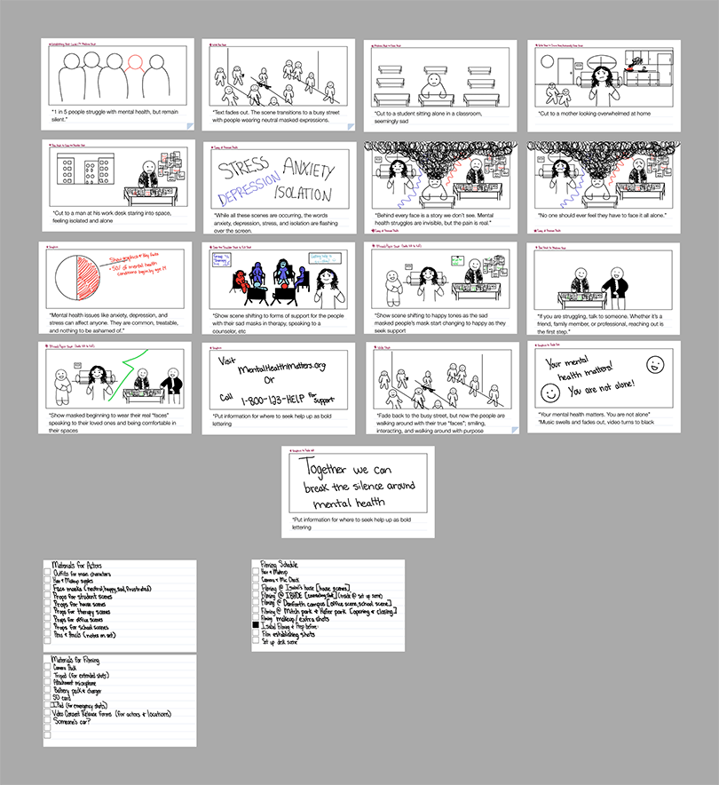
Once I was able to create a base plot synopsis and conduct proper research on this topic, I was able to create a final script for my Video Production:
Script for PSA: “Break the Silence: Your Mental Health Matters”

(Black screen with soft, slow music in the background)
White text fades in:
“1 in 5 people struggle with mental health, but most remain silent.”

(Text fades out. The scene transitions to a busy street where people pass by, each wearing neutral masked expressions.)

Cut to a student sitting alone in a classroom.
Cut to a mother looking overwhelmed at home.
Cut to a man at his work desk staring into space.

Brief flashes of words overlay the scenes:
“Anxiety. Depression. Stress. Isolation.”

Voiceover (calm):
“Behind every face is a story we don’t see. Mental health struggles are invisible, but the pain is real.”

Camera zooms in on each individual’s face, revealing a hidden mask of fear, sadness, and exhaustion.

Voiceover:
“No one should feel they have to face it alone.”

Voiceover:
“Mental health issues like anxiety, depression, and stress can affect anyone. They are common, treatable, and nothing to be ashamed of.”

Cut to a graphic showing key facts:
“50% of mental health conditions begin by age 14.”
“Seeking help early can prevent long-term effects.”

Scene shifts to forms of support for the people with the sad masks: a group therapy session, a person texting a crisis hotline, and someone speaking with a counselor.
The mood lightens as the sad people’s masks fade into happy masks and they are seen smiling and engaging in supportive activities.

[Call to Action]

Voiceover:
“If you’re struggling, talk to someone. Whether it’s a friend, family member, or professional, reaching out is the first step.”

Show masked individuals speaking to loved ones or counselors, with a look of relief and comfort. This is done to show how they are getting more comfortable with their feelings and beginning to wear their true masks

On-screen text:
“Visit MentalHealthMatters.org or call 1-800-123-HELP for support.”

Fade back to the busy street, but now the people are walking around with their true masks smiling, interacting, and walking with purpose.

Final text fades in:
“Your mental health matters. You are not alone.”

Voiceover:
“Together, we can break the silence around mental health.”

Music swells and fades out. Screen turns black.

Storyboarding:

Audio & Sound Editing:

Rough Cut:

Final Video Production:

Map of Mexico
-Illustrator Skills Showcase Project

Project Brief :

The goal is to create a versatile digital asset that can be used across various mediums such as; websites, posters, or gift. This is to be done in order to attract attention, educate viewers, and promote interest in Mexican heritage. This map aims to enhance the user experience, drive engagement, and serve as a compelling portfolio piece demonstrating creative and technical skills in illustration.

Project Synopsis:

My Project Synopsis:

For my final project I decided that I would be making an illustrated map of Mexico. I have strong ties to my Mexican heritage and wanted to exemplify the diversity and detail of the whole of Mexico through a map of the entire country. I decided I wanted to create this map as a combination of both topographical and pictorial map elements in order to create a project that would meet all the project specifications and showcase the elements I wanted to display properly

Brainstorming & Research:

In order to figure out what direction I will need to take this project in, I will first need to break down and brainstorm the three individual concepts for theme of this project:

Key Map Elements: Landmarks & Cultural Icons

Landmarks

  1. Historical Sites:
    • Chichen Itza (Yucatan)
    • Teotihuacan Pyramids (near Mexico City)
    • Monte Albán (Oaxaca)
    • Templo Mayor (Mexico City)
  2. Natural Wonders:
    • Copper Canyon (Chihuahua)
    • Monarch Butterfly Biosphere Reserve (Michoacán)
    • Cenotes (Yucatan Peninsula)
    • Volcán Popocatépetl
  3. Modern Icons:
    • Angel of Independence (Mexico City)
    • Frida Kahlo Museum (La Casa Azul, Mexico City)
    • Guadalajara’s Hospicio Cabañas
    • Cumbres de Monterrey National Park

Landmarks and Cultural Icons by State

  1. Aguascalientes: Feria de San Marcos (annual fair); Museo Nacional de la Muerte (Museum of Death).
  2. Baja California: Valle de Guadalupe (wine region); La Bufadora (blowhole).
  3. Baja California Sur: Arch of Cabo San Lucas; gray whale watching in Magdalena Bay.
  4. Campeche: Edzná ruins; colorful colonial architecture of Campeche City.
  5. Chiapas: Palenque ruins; Sumidero Canyon; textiles of San Juan Chamula.
  6. Chihuahua: Copper Canyon; Paquimé archaeological site; Tarahumara (Rarámuri) culture.
  7. Coahuila: Sierra de Zapalinamé; Dinosaur Museum in Saltillo; vineyards of Parras de la Fuente.
  8. Colima: Volcán de Colima; Manzanillo beaches; Comala Pueblo Mágico (magic town).
  9. Durango: Old West movie sets; Mezquital cave paintings; Basilica of Durango.
  10. Guanajuato: Mummies of Guanajuato; Callejón del Beso (Alley of the Kiss); Alhóndiga de Granaditas.
  11. Guerrero: Acapulco cliffs; Taxco silver crafts; La Quebrada cliff divers.
  12. Hidalgo: Prismas Basálticos (basalt columns); Tula de Allende (Toltec ruins).
  13. Jalisco: Tequila (town and agave fields); Mariachi music; Lake Chapala.
  14. Estado de México: Teotihuacán pyramids; Nevado de Toluca volcano.
  15. Michoacán: Monarch butterfly sanctuaries; Pátzcuaro Lake and Janitzio Island; Day of the Dead celebrations.
  16. Morelos: Xochicalco archaeological site; Cuernavaca’s gardens.
  17. Nayarit: Islas Marietas; Huichol beadwork and textiles.
  18. Nuevo León: Cerro de la Silla (iconic mountain); Fundidora Park in Monterrey.
  19. Oaxaca: Monte Albán ruins; Hierve el Agua petrified waterfalls; Guelaguetza festival.
  20. Puebla: Cholula pyramid; Talavera pottery; Cinco de Mayo historic sites.
  21. Querétaro: Peña de Bernal monolith; Querétaro aqueduct.
  22. Quintana Roo: Chichen Itza; Tulum ruins; cenotes and coral reefs.
  23. San Luis Potosí: Edward James’ surrealist garden in Xilitla; Huasteca Potosina waterfalls.
  24. Sinaloa: Mazatlán’s malecón (seaside promenade); Banda music.
  25. Sonora: El Pinacate desert biosphere; Yaqui cultural festivals.
  26. Tabasco: La Venta Museum and Olmec heads; cacao plantations.
  27. Tamaulipas: El Cielo Biosphere Reserve; Tampico historic district.
  28. Tlaxcala: Huamantla fair and carpets; Cacaxtla murals.
  29. Veracruz: Papantla’s Voladores (flying dancers); El Tajín archaeological site; Gulf cuisine.
  30. Yucatán: Uxmal ruins; pink salt lakes of Las Coloradas.
  31. Zacatecas: Silver mines; Cerro de la Bufa lookout.


Cultural Icons

  • Food Symbols: Tacos, Mole, Tamales, Chiles en Nogada
  • Artistic Symbols: Papel Picado, Huichol Art, Mariachi Band
  • Traditional Clothing: Charro Suits, Huipiles
  • Festivals: Day of the Dead Altars, Piñatas

Style Definition

Target Market Preferences:

  • Vibrant and visually engaging designs for both locals and tourists.
  • Incorporate hand-drawn or illustrated styles with whimsical elements to reflect Mexican folklore and charm.
  • Blend historical and modern aesthetics to appeal to a wide demographic.

Style Characteristics:

  • Use folk art motifs for patterns.
  • Playful proportions and exaggerated shapes (as seen in pictorial maps).
  • Dynamic layouts with layered elements to convey depth and detail.

Color Scheme (Reflecting Mexican Themes)

Primary Palette:

  • Warm Colors: Mexican Red, Bright Orange, Sunflower Yellow (symbolizing festive energy).
  • Cool Colors: Turquoise, Cactus Green (reflecting landscapes).
  • Neutral Base: Sand Beige, Charcoal Gray (for balance).

Accents:

  • Metallic Gold: Evoking colonial heritage and religious art.
  • Bright Pink & Purple: Inspired by traditional textiles and celebrations like Día de los Muertos.

Font Selection

  • Primary Fonts:
    • Decorative, playful fonts (e.g., Lora, Alegreya) to match folk art elements.
    • Handwritten styles to evoke authenticity and approachability.
  • Secondary Fonts:
    • Clean sans-serifs like Open Sans or Raleway for readability in smaller labels.

Icon Styles

  • Illustrative Icons:
    • Hand-drawn, slightly textured designs to emulate artisanal quality.
    • Simplified, colorful representations of landmarks, foods, and cultural elements.
  • Border Embellishments:
    • Frame the map with designs inspired by Talavera tiles or Otomi embroidery patterns.

Initial Sketches:

Background & Topography:

Landmarks & City Iconography:

Coloring & Shading:

Final Map:

Business Professionals of America- Visual Design Team Project 2025

BPA Visual Design Competition

Your team has been hired to design promotional components for a local farmers market, Rustic Roots – Nature’s Charm, Crafted with Care. The team must create a logo for the farmers market and at least three (3) additional items. Other items could include a roadside sign/banner, postcard, T-shirt, swag, reusable bag, social media ads for Facebook, Instagram, and TikTok, etc. In addition to the logo, include the following information on the three (3) items:

  • Location: Alligator Lake, Downtown Orlando, FL
  • Dates: April – October on Saturdays
  • Operating Hours: 7 a.m. – 1:30 p.m.

Our Team

Azavia Cherry

Isabel Cárdenas Orozco

Elliot Garvin

Production Process

Concept Sketches

Color Palettes

Initial Logo Iterations

Final Logo Design

Logo Variations

Merchandise

Mug, Tote Bag, & T-Shirt Designs

By Azavia Cherry

Roadside Banner Design

By Elliot Garvin

Postcard Design

By Elliot Garvin

Coloring Book Design

By Azavia Cherry

Sticker Sheet Design

By Isabel Cárdenas Orozco

CorrectoMundo Electrical Company Website- HTML & CSS Skills Showcase Project

Project Brief

I decided to do the “You Decide” prompt for this project. My idea for this project was to build an interactive website for a local electrical company. One element that was present in my You Decide prompt was for the website to have elements and details relating to the group that it is for, and to also make that content interactive and responsive for all users.

Brainstorming & Research

In order to figure out what direction I will need to take this project in, I first needed to create a structured layout and style fit to the company’s criteria for this website design.

Once I decided what to design, I then began to analyze and research competitors and their online presence and marketing strategies. This was done in order to design a standout website for Correctomundo by better understanding the local market and competitors.

Style Guide Creation & Client Meeting Notes

Once I had gathered the brainstorming and research, I was then able to create a style guide that I created through information I received directly from my client during our meetings. Below are the style guide and client meeting notes:

Style Guide

Client Meeting Notes

Layout Planning

Once I had created a style guide and received initial notes from my client pertaining to their website;  I was then able to create a basic layout plan to follow throughout this project. Below is my layout planning:

Layout Planning Notes

HTML & CSS Coding

Once I had created a layout plan;  I was then able to create my html and css coding that would serve as the base this project. Below is my html and css coding:

HTML

CSS

Client Review

Once I had created a sample of what the final HTML/CSS code would look like based off the client criteria, style guide, and layout plan I was then able to present my work to my client for review. Below are the client review and feedback notes I was able to receive in order to make final changes for my website:

Client Review 1

Client Review 2

Final Website

After much client review, checking all my work through code validators to assure that there were no errors, conducting tests with potential clients, and getting feedback from others; I was then able to create the final code for this website and publish it for my client.

Below is a link to the final website for CorrectoMundo Electrical Company: