Skip to content

Skills Showcase

For this project, I created a full visual brand for an original journal and notebook company over the course of 30 work hours, including the company name, logo, and overall identity. The goal was to build a brand that feels cohesive, recognizable, and appealing to its target audience.

I designed a range of materials—business card, billboard, product mockup, and social media graphic—to show how the brand translates across different formats. A clean, minimalist design was especially important for this type of brand, as it allows the products themselves to shine while maintaining a sophisticated and approachable look. Each piece stays visually consistent while adapting to its purpose across both print and digital spaces.

This project highlights my ability to take a concept from an idea and develop it into a complete, unified brand system that emphasizes clarity, balance, and visual appeal while working within a structured time limit.

Step 1: Mood Board

I used a moodboard to help guide the overall direction of the brand, especially when choosing colors and visual style. By gathering inspiration first, I was able to narrow down a palette of black, off-white, grey, and dusty blue that felt calm, modern, and cohesive. The moodboard also helped shape the clean, minimal design of the products, ensuring everything stayed consistent and visually aligned with the brand’s identity.

Step 2: logo creation

The next step was creating the logo. I chose a very simple vector design with clean lines to ensure it would be easily recognizable and versatile across different applications. The minimalist approach keeps the logo modern and timeless while aligning with the brand’s overall clean and understated aesthetic.

version 1

I wanted the design to feature a sheet of paper with a folded corner, accompanied by a pencil making a playful scribble or doodle.

version 2

I refined the composition by making the scribble smaller and extending the pencil for better balance, while adding a subtle mark to represent the pencil lead.

Version 3

I adjusted the pencil’s length to achieve better overall balance, ensuring every element—the pencil, doodle, and paper—had its place and felt harmonious within the composition.

version 4

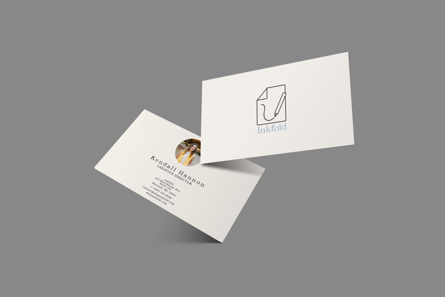
In the final version, I added the brand name in a clean serif font to complete the composition. The serif adds a timeless, sophisticated feel and contrasts the minimalist illustration, while keeping all elements balanced.

step 3: business card

For the business card, I kept the design simple and clean, placing the logo on one side and centering the brand name and contact information on the other. A vertical line separates the name and title from the contact details, creating a clear, organized layout that aligns with the brand’s minimalist aesthetic.

step 4: Product mockup

The product mockup features a white standard-sized notebook with a clean white band accented by a thin strip of dusty blue at the top. The logo is presented in a horizontal layout, with the serif brand name beside it, while the informational text is set in a simple sans serif font. This combination reinforces the minimalist aesthetic and creates a balanced, modern look for the product.

step 5: billboard mockup

The billboard mockup captures a moment of creativity, showing a hand sketching a hot air balloon in a notebook. The logo sits thoughtfully in the bottom-right corner, paired with the tagline ‘Where creativity begins’ and a clear call to action, ‘shopinkfold.com,’ to guide viewers while keeping the design clean and approachable.

step 6: social Media graphic

For the social media graphic, I utilized a balanced multi-notebook lineup and applied depth-of-field blur to the secondary notebooks, creating a clear hero focal point and premium product feel, enhancing visual hierarchy for scroll-stopping minimalism.