Project Process
Step 1: Brainstorming and Researching
For this project, I had been stuck on a particular design for a while. I wanted to do something that was pretty basic and not very busy, especially with possible mass printing considerations in mind.
For research, I made notes to myself beneath the assignment on the project management site that my class and I use. The links included are links to different parts of the official BPA website since I was also thinking of doing a design that incorporated past and future, but I also new that a design like that could get complex and may lose details when put on a smaller scale, like the stress ball for example. I also knew that it could get difficult when it came to using photos from BPA’S history and past that I don’t have the proper rights to.
I also included links to BPA’s branding guidelines, which was a great source for picking colors and finding the exact font that BPA uses with their branding. I also included links to some BPA logos and such that my teacher has access to so that I could pull an exact logo rather than lettering my own.
Step 2: Sketching
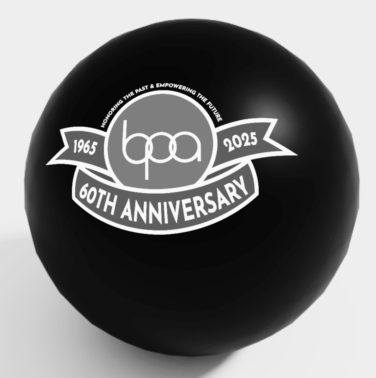
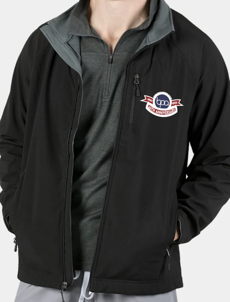
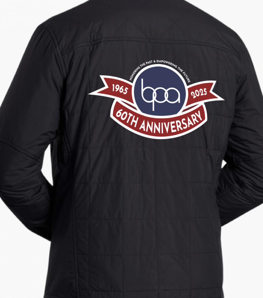
For sketching, I was fairly set on one design. That being a design that includes the BPA circular logo with a ribbon that goes along the bottom and has ends showing to the left and right. I felt that this was a strong design choice, since I was able to include the BPA’s starting year and current year, and I was able to include the “60th Anniversary” title on the main part of the ribbon to symbolize and emphasize that BPA has run for 60 years in total from 1965 to 2025.

The sketches are numbered, as to make it easier for my classmates to give feedback on which designs they liked and disliked. I included different color combinations and motto placement possibilities. Ultimately, everyone was fairly set on how design #3 looked.
I had also gone with putting the full “Honoring the Past & Empowering the Future” motto since I liked how it sounded together in whole rather than separately as an either/or choice.
Step 3: Cleaning Things Up
Using Adobe Illustrator, I was able to bring my design to life. By using the curvature tool, shape tool, and shape builder tool, I was able to transform my sketch into the real deal. My biggest help was the official BPA branding guide that they have listed on their website, because it made it easy for me to find and download the exact font that BPA uses in their branding, as well as the exact color hex-coding that they use when it comes to coloring.

Step 4: Going from Design to Product
Once my design was ready to go, I went to the internet and found some images to use for my mockups by using the Creative Commons filter feature. Finding photos with this license make it less likely for me to get beat with copyright issues in the future, and once I had my photos of a windbreaker (front and back) and a basic black stress ball, I used the mockup tool in illustrator to make the mockup look more genuine.

Step 5: Taking it to Competition
For competition, I wanted to make a real version of my mockups. Not just for myself and my presentations sake, but also to show the judges how it would look in person since it might’ve been difficult to go off of photos alone. I ended up picking a cheap windbreaker and a multipack of black stressballs from Amazon so I could take it to the PRL and make the design a reality.
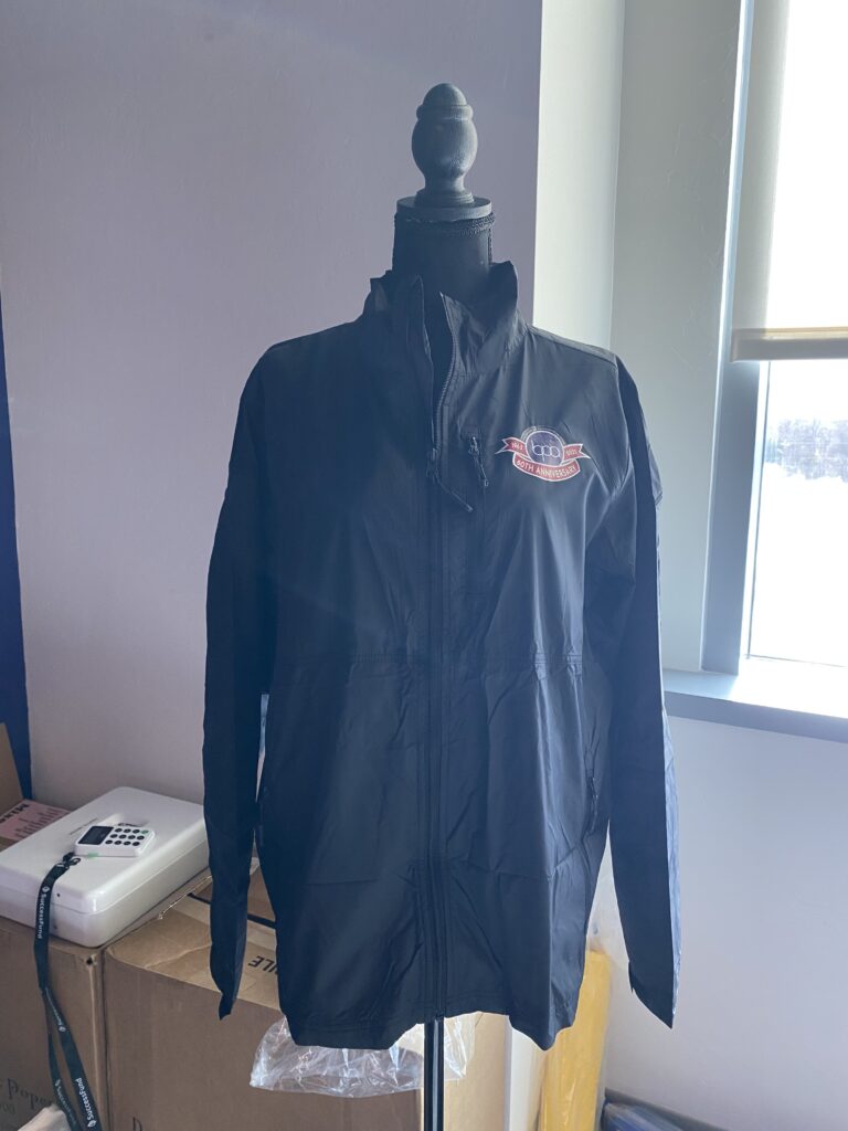
Applied using heat press method.
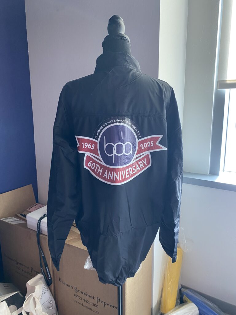
Applied using heat press method.
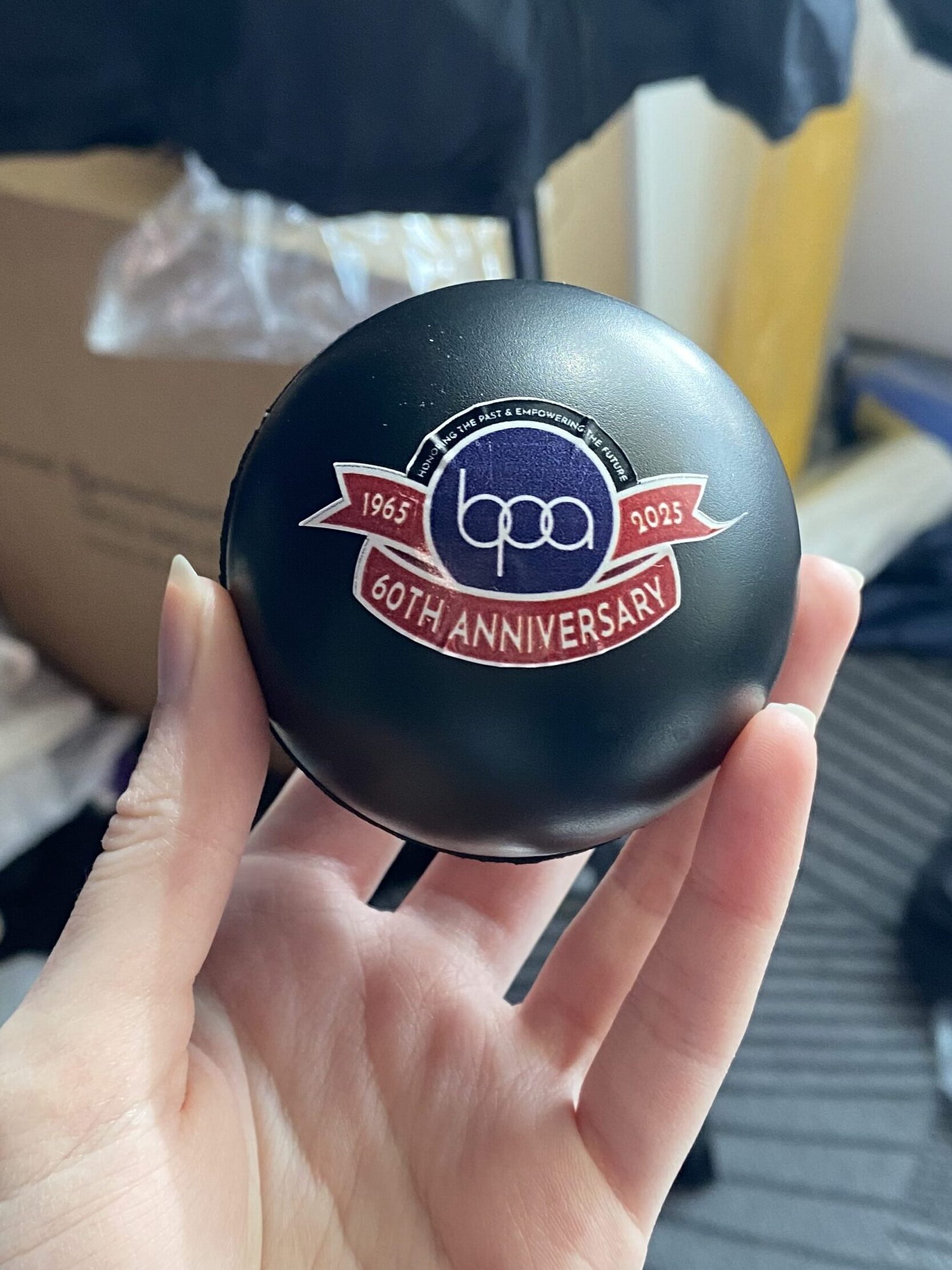
Applied using a simple sticker method.
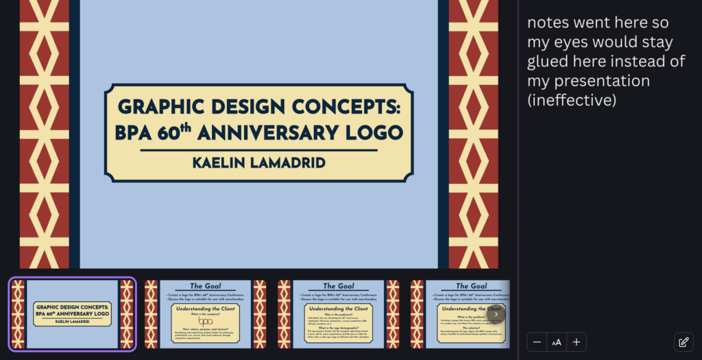
On top of some real mockups, I had to create a presentation that I would show to the judge. This was simply made using Canva so I could apply awesome transitions and what not. I also made sure to use lots of professional grammar to make is seem as though I confidently knew what I was doing and what I was talking about. When it came to presenting, I hooked my laptop up to a second monitor so I would be able to keep notes for myself on my own screen.
And of course, after lots of dedication, mannequin abuse, and practice…

… a killer 2nd place Graphic Design Promotions medal for myself and my mannequin plus one.