For the Illustrator’s skill showcase, I made the interesting choice to overload my plate. Students were given multiple options for this 30 hour project, from six tattoo designs to basic product design. But I wanted to do something for me. Something like, a soundtrack album.
The First Steps
I created the album concept off my original novel series, “Ruya’s Universe”. A space opera that features everything from family, oppression, revolution, and the return of a forgotten Deity.
For the album I wanted it to project the essence of the story. My audience is everyone. All ages and backgrounds, people who simply wish to enjoy good music. Those who want to dream as the universe falls within their grasp.
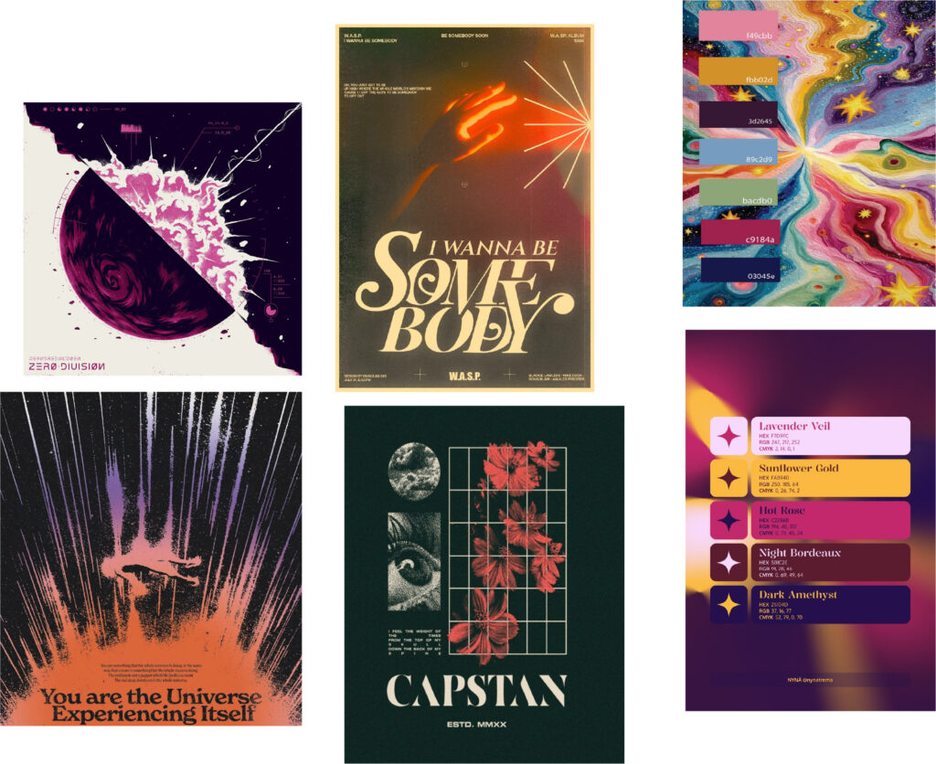
In order to convey this message I first had to get a rough idea of the visual identity for the project.
The colors, I wanted people to imagine our galaxy. The typography itself was different, I didn’t want to go for the classic sci-fi look. So I chose simple but lovely fonts that do the job all the same.
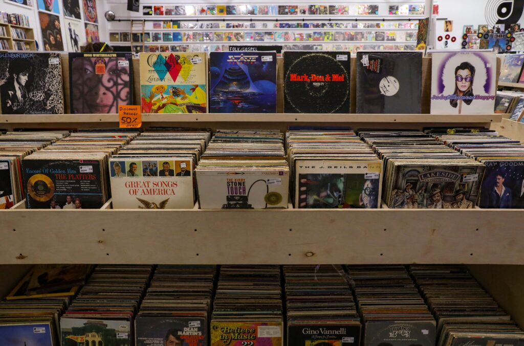
After that, it was time to start brainstorming the pieces I wanted to go inside the album box. If you must know, I was heavily inspired by the Kpop industries version of albums.
Creative Process
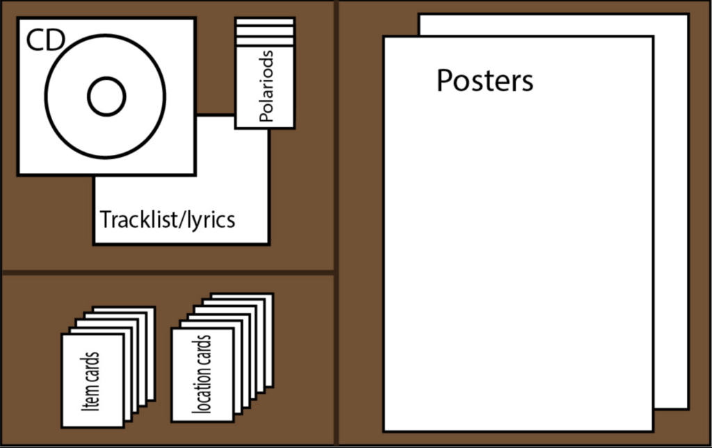
As shown above I had big plans for the album, which included seven separate parts I needed to create.
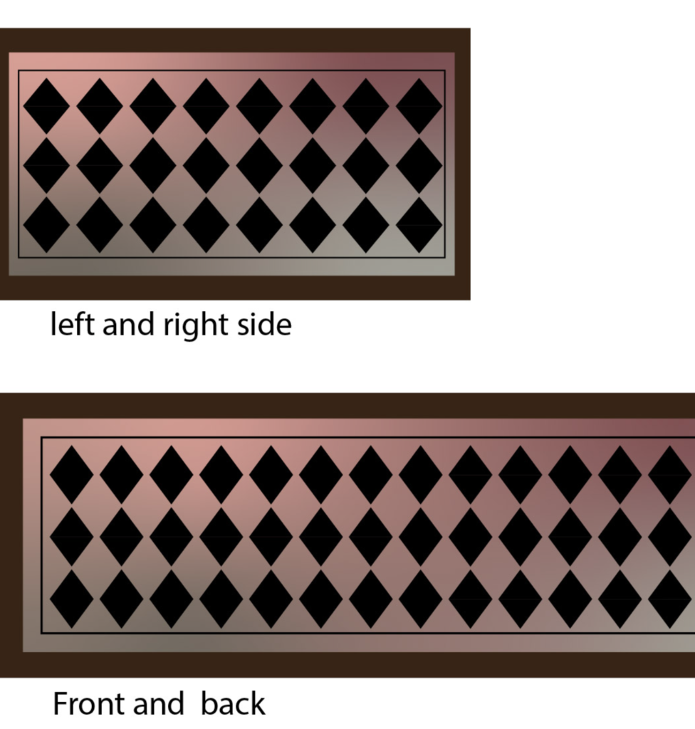
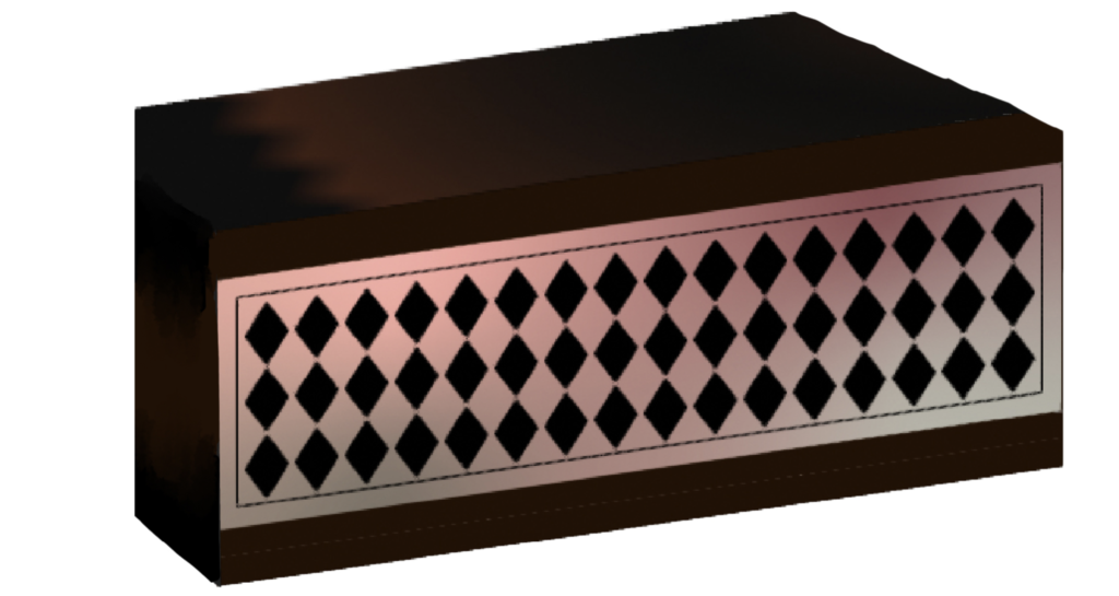
The very first thing naturally was the box in which everything would come in. I actually spent the most time on this as I couldn’t quite figure out how I wanted to design it.
Thankfully I came to my senses and realized that the album box itself can be whatever I wish it to be. So I chose a design that was inspired by Middle Eastern ornate boxes.
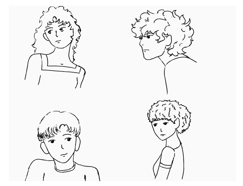
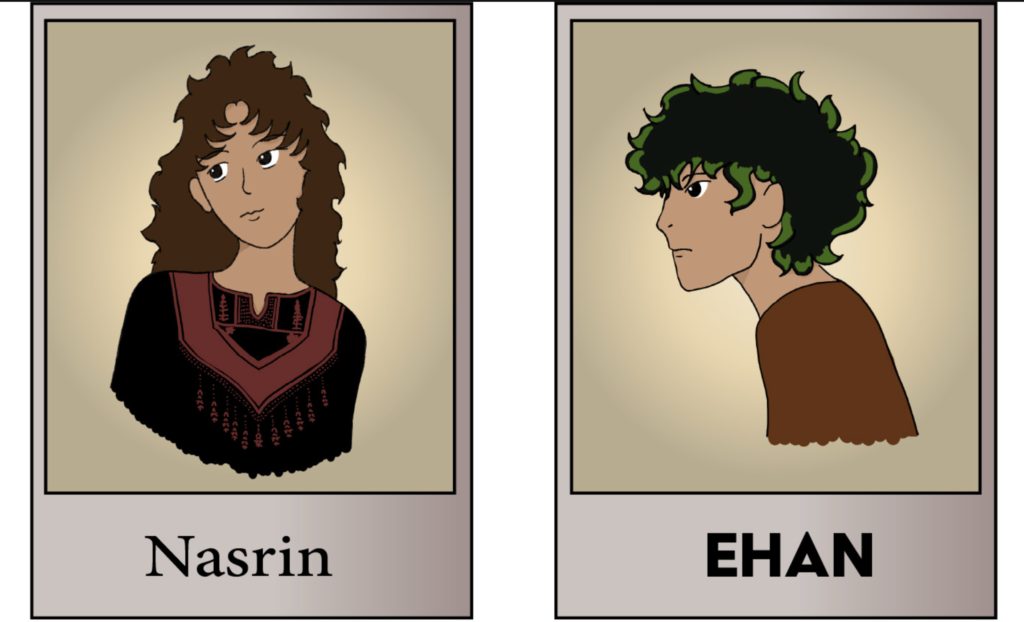
Next up were the Polaroids of the main cast. I was originally hoping to get all four characters, but realized that, there simply wasn’t enough time. I am still working on improving my artistic skills, so my time is limited.
I decided on Captain of the Al-Muruna, Nasrin, and our main character Ehan.
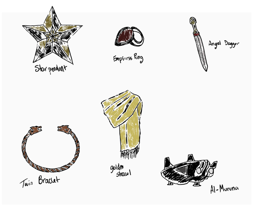
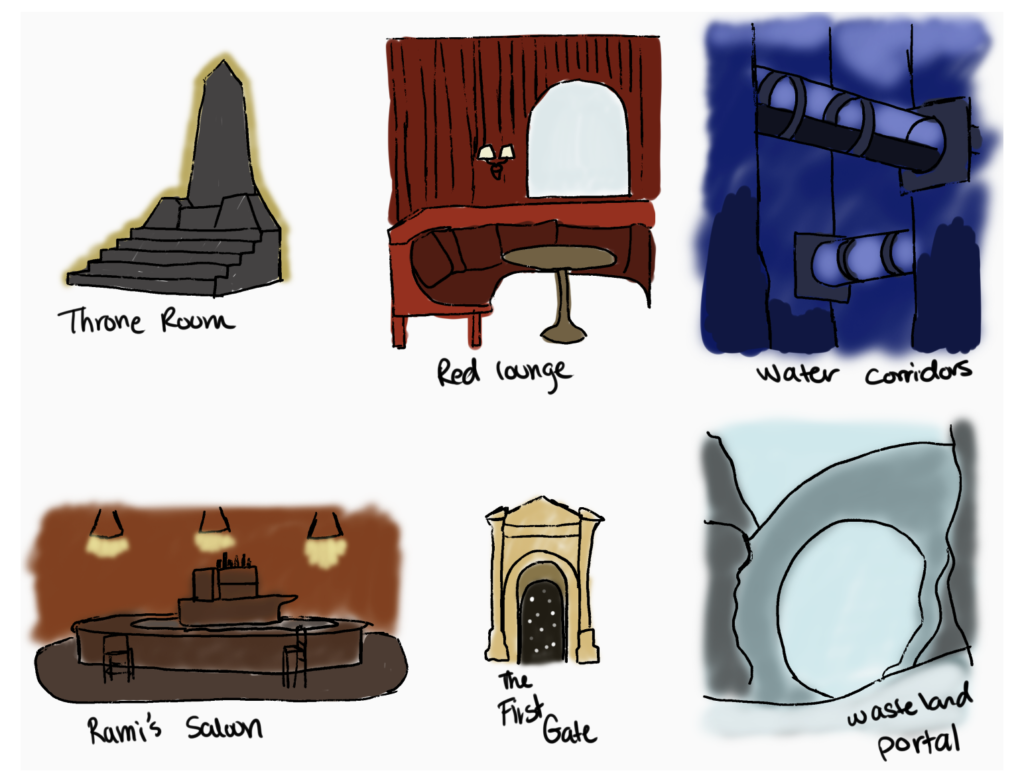
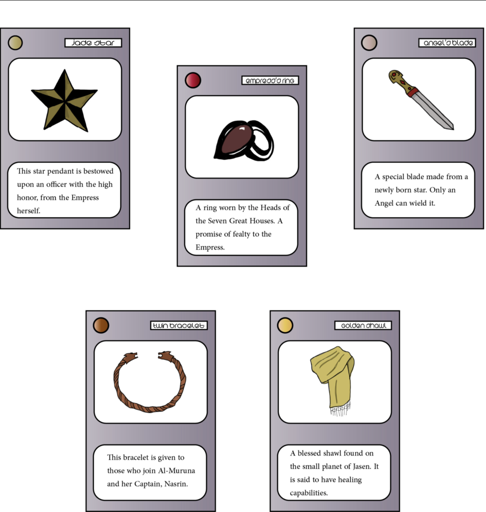
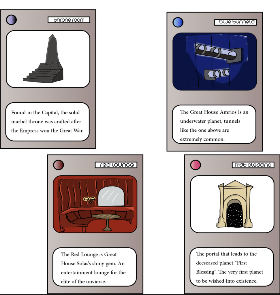
Afterwards I began working on the special cards. Six location and six item cards. These were inspired by the card games I’d play growing up. Similar to things like Yu-gi-oh! and Pokemon.
Like my Polaroids, I was planning having multiple for each deck, but made the choice to cut out three out. The spaceship from the item deck, and both Rami’s Saloon and the Wasteland Portal from the location deck.
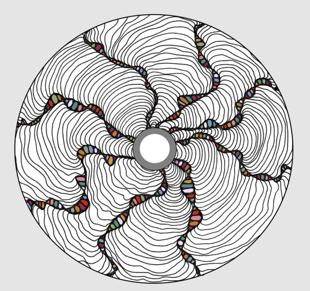
When I came time to design the cover of the CD, I ended up on TikTok for ideas. I knew I didn’t want any faces or places, but something that fit the story through plain art.
I came across an art style that I had tried out back in middle school, Zen tangles. A few videos later and I was in the classroom attempting to create my own on a disk.
I liked the black and white look, but it needed some color. So I went through the palette in my visual identity board and voila!
P.S. My Mom said it looks like an eyeball.
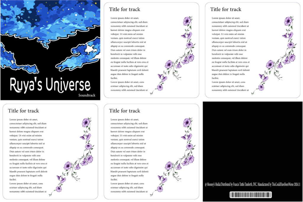
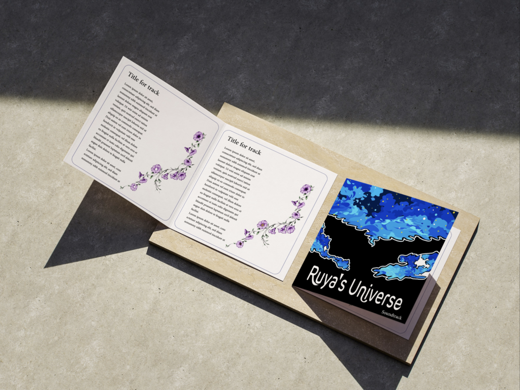
For the booklet, it was just like my CD. No real planning actually went into the process, which is okay. Like many others, I tend to be my most creative when I go in blind. The hardest part was formatting everything so that I could see each individual page.
For the art I used a piece from ands-mahardika on Unsplash. I took the blue clouds and cut the rest out. The flowers are Moonflowers, the represent the main character Ehan, and his status.
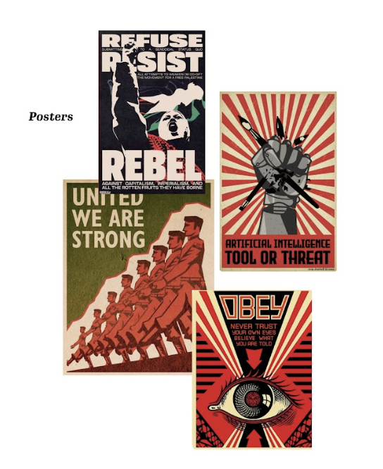
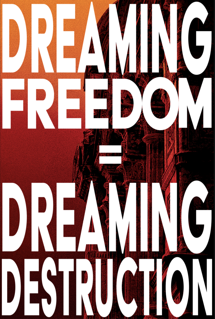
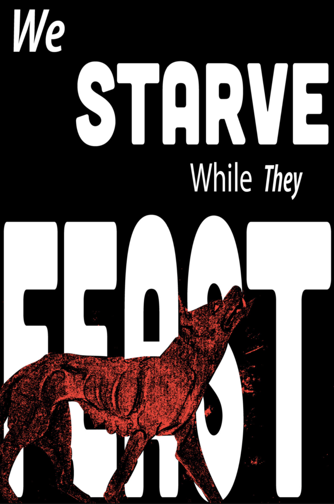
The last pieces, the propaganda posters, were done completely on their own. No prep except for some inspiration.
Final Products
After spending countless hours (seventeen to be exact) I finally approached the fun part of the showcase. Putting everything into mockups and or just polishing the final product.
Since I didn’t have a draft version to show you, I will start with the posters. The first one features the Empire’s message to the masses. The one that follows is the Rebellion’s, a message that many for some reason refuse to heed.
Up next is the Album box in its mostly 3D glory, making boxes is harder than it looks.
For the Polaroids I wanted to have them look like actual photos. I added gradients to them to give them that clear shine.
The same was done up for my cards. Each has the name of the item or location and a brief description. On the top left corner is also a colored circle that pertains to each one.
For the CD and its booklet, I am not ashamed to admit that it took forever to find a mock-up to use for both. Another problem to overcome in this project is finding free available resources for a broke student to use.
For the booklet I managed to find a site that had some free options for Photoshop. As for the CD, I had to end up using Canva for a template.
Closing Statements
This project was the highlight of the month. I was able to use the skills I have cultivated for the past nine months and create something for a beloved story of mine.
I managed to wrap everything up with time to spare. The toughest parts were literally just being able to find free resources to use. I am happy with how everything turned out and hope that it only goes up from here.