My Work
Logos + Brand Design
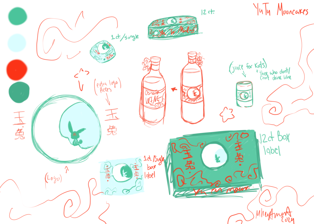
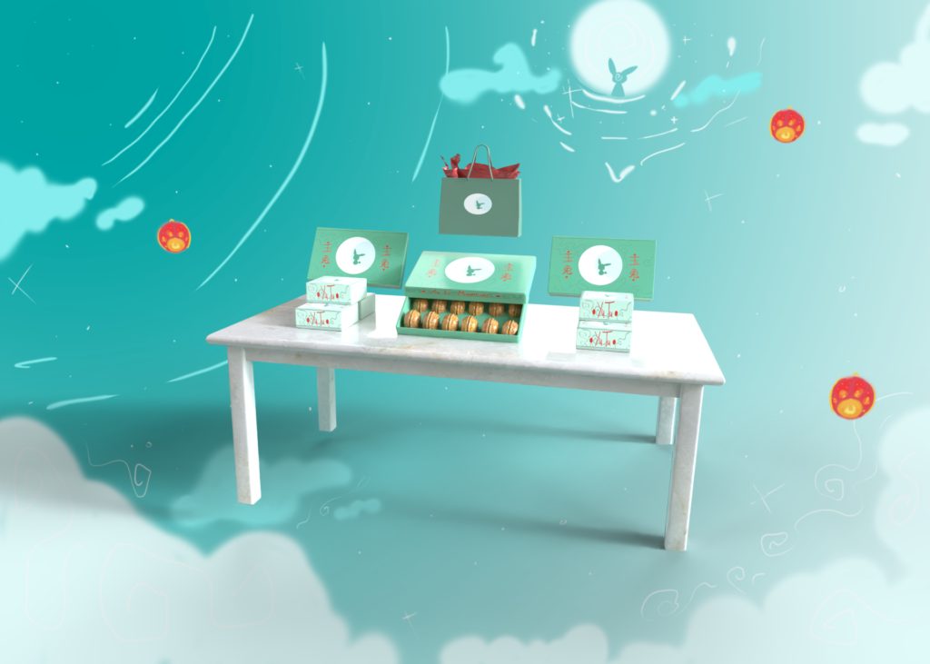
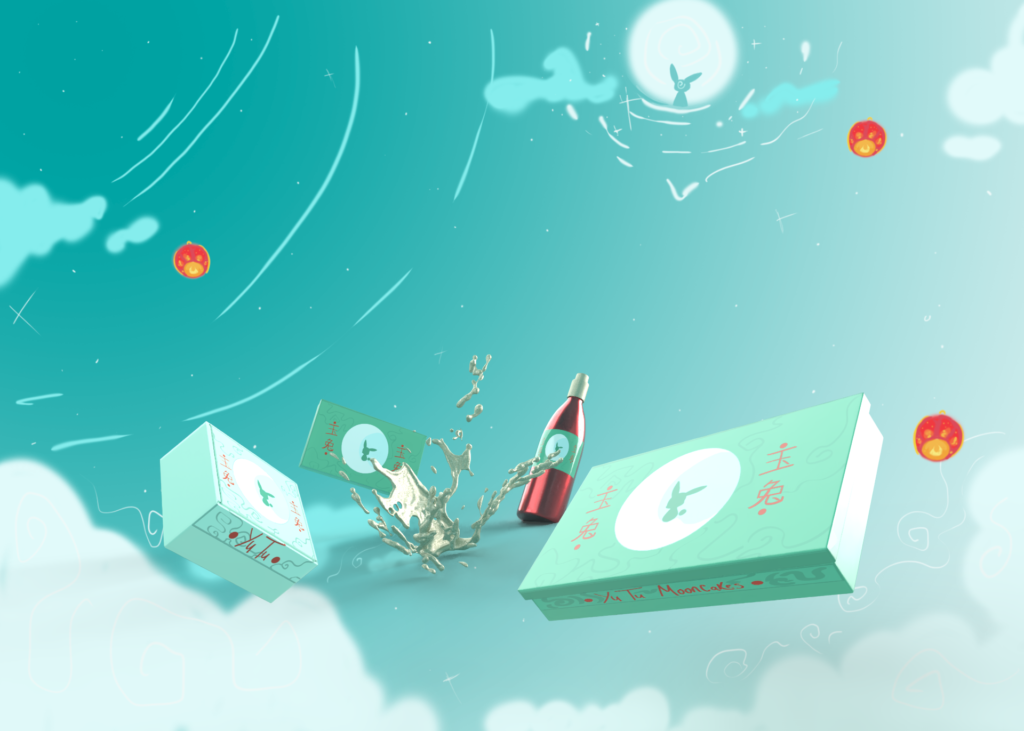
“Yutu Mooncakes Design”
In honor of the Chinese mid-autumn festival, I wanted to choose products that would help carry the rest of its traditions along.
The design that was chosen in this draft was for the Chinese myth of the moon goddess, Chang’e, and her companion named “Jade Rabbit”.
The name of this brand, “Yutu” is the Chinese translation for Jade Rabbit. The colors of this design were picked for the purpose of the symbolism of the mid-autumn festival. as well as expressing prosperity, and success.
A rabbit sitting on the moon was decided, as those celebrating the festival gaze at the moon in honor of Chang’e, along with a cloud pattern to represent the hopes of good weather and harvest in the upcoming year.
Video Games + Concepts
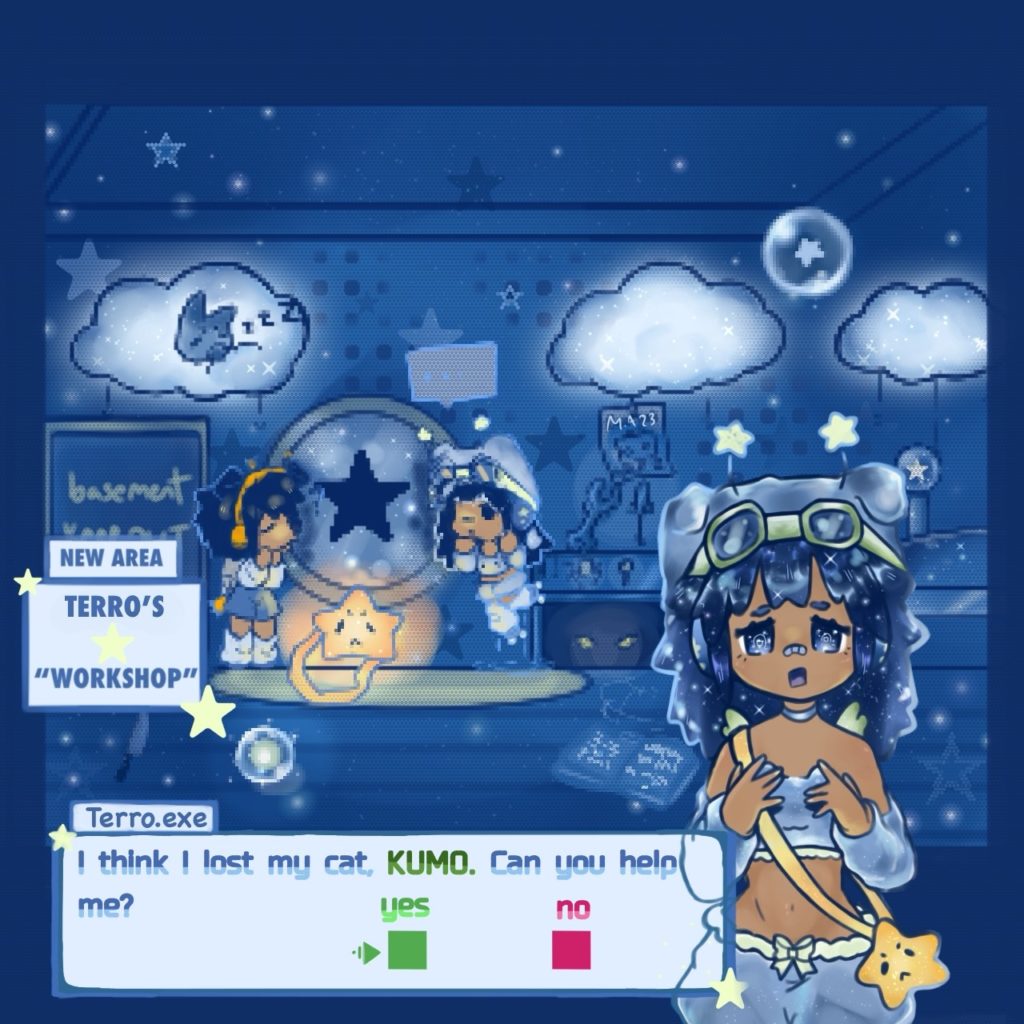
“Terro’s Workshop” – Chat Screen
Taking inspiration from video game dialogue screens, I wanted to create one in my own style for the first time.
For this piece, I used RPG dialogue screens as reference, while maintaining my personal style.
Lastly, the main focus of this piece was to make it feel like this screen could be apart of a real game. I also wanted to keep consistencies in small background details, such as the mirror and light reflections.
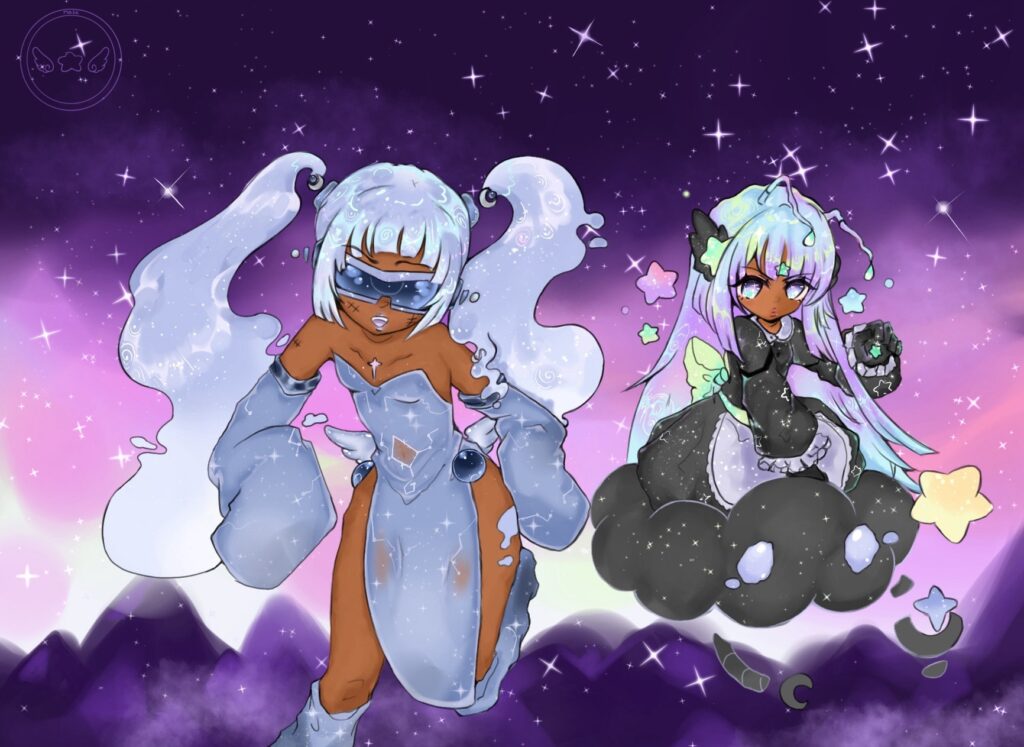
“Beam Blaster”– Main Characters
A cyber angel and a runaway alien princess?
The designs for these characters were meant to reflect an outer space/galaxy theme. Each character’s outfit holds elements of their personalities and backgrounds.
For the characters themselves, I wanted to have some kind of contrast while still fitting each other and having their own unique elements about them.
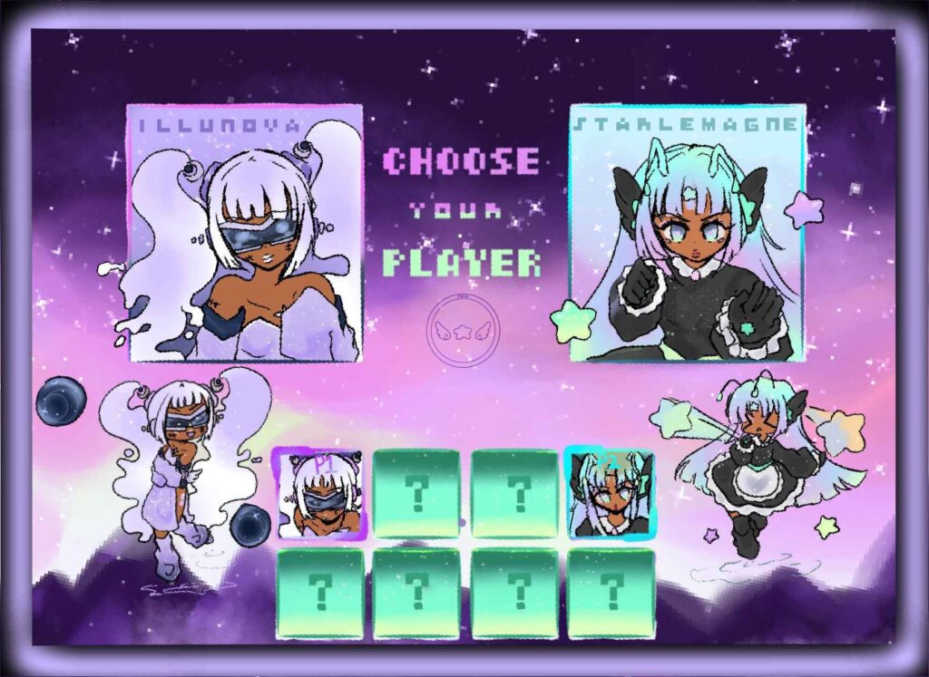
“Beam Blaster” – Character Select!
This character screen has taken heavy inspiration on the 90’s game, Money Puzzle Exchanger (NeoGeo, 1997) and its character selection screen.
Simplifying the characters and all of their small details was heartbreaking, but seeing as it needed to be pixelated later, completely necessary.
Keeping the colors together was a challenge since the characters would end up with different color palates, and the colors would be a bit more likely to clash with each other.
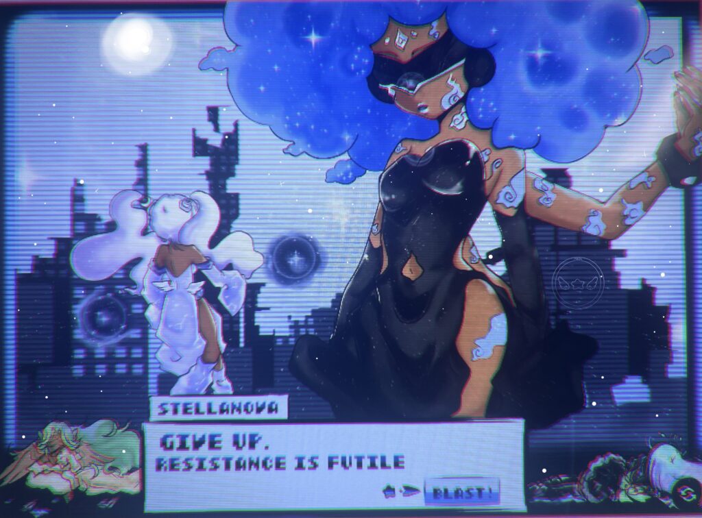
“Beam Blaster”- Dialogue
This part of the project was to make everything seem more like it could be part of a real game.
Staying with the theme but also adding my own style into projects like these can be a bit challenging, but definitely helped with the exploration of new styles and techniques that were discovered.
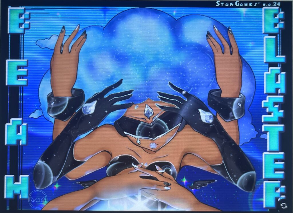
“Beam Blaster”- Cover Art
For the cover art of Beam Blaster, I wanted the game’s first boss to be the cover since she is an important piece to the story.
Displaying one of her abilities that wouldn’t be immediately shown if someone were to play the game was a way that could catch a person’s interest, which became the main idea for the cover.
3D Modeling
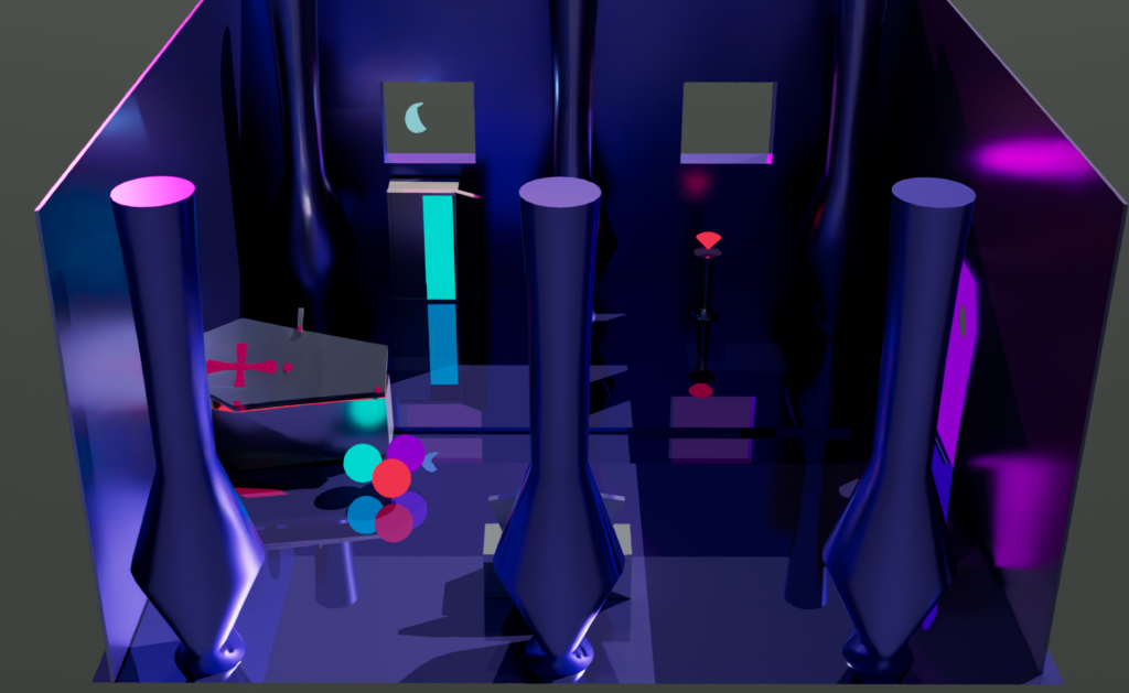
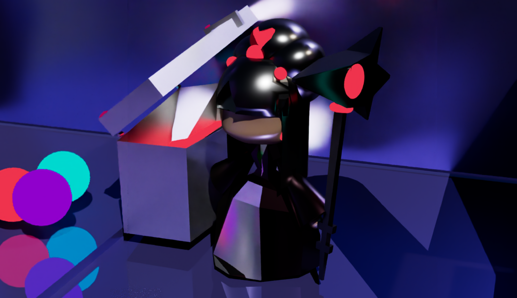
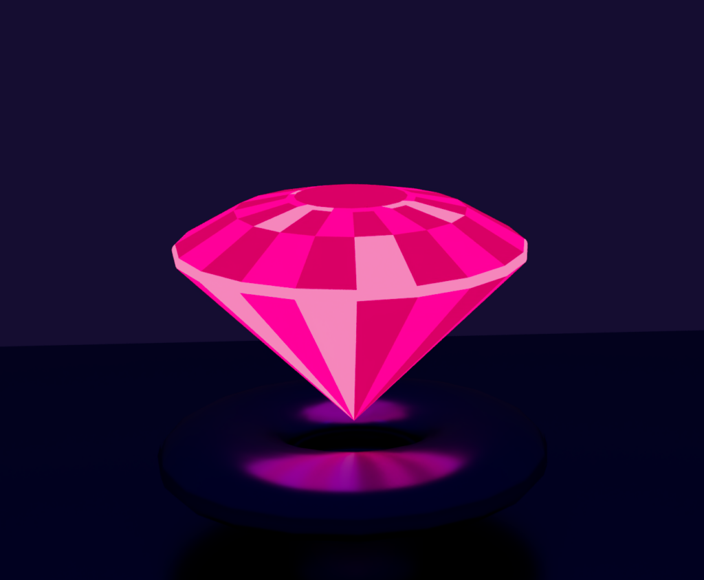
Game Assets – “Lilith’s Castle”
The theme for these assets were inspired by the 18th Century.
I created a coffin bed, a gemstone, a weapon, and a vampire character.
While taking inspiration from the time period, I still kept my own personal style, as well as creating a map or scene to create a better idea of how these assets could look in a real game.
