Sun Bands Showcase
SunBands is a retro new stock sunglass company whose focus is on providing retro-themed glasses at an affordable price.
Brand Mission
Our mission is to provide high-quality retro-style sunglasses at an affordable price for anyone and everyone because we believe you have the right to be yourself.
Iterations

This is the final logo design. My main goals were to keep the logo simple and easy to recognize. I also wanted the logo to look the same regardless of the color of the logo.
I definitely like this logo more than the first one.
![]()
This is the logo I went for. I originally wanted the logo to be orange colored, but then decided against that because I thought it would look too distracting, so I decided to just use red and black for the logo’s color palette.
Assects by Preston Mcintire is marked with CC0 1.0
Description
When creating the logo, I wanted it to feel retro but not overdone; I also wanted it to be memorable, and able to be used on any product.
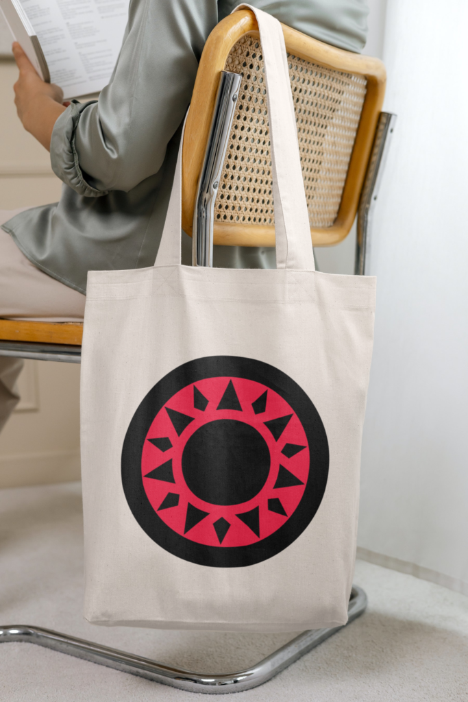
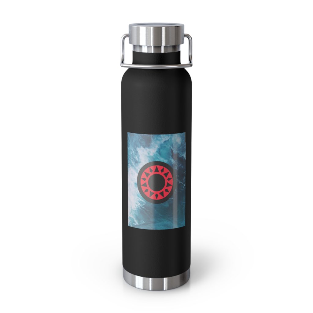
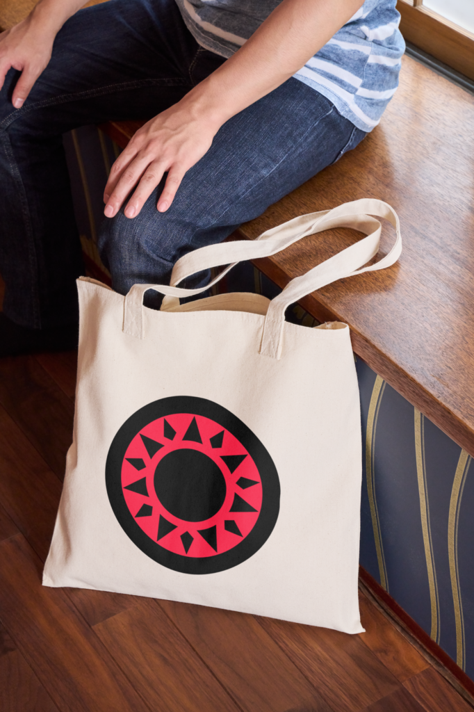
The logo consists of a black circle outline with a bright red inner color and a sun in the middle.
The logo is supposed to represent the rising sun and the brightness the sun holds.
Billboard
Iterations
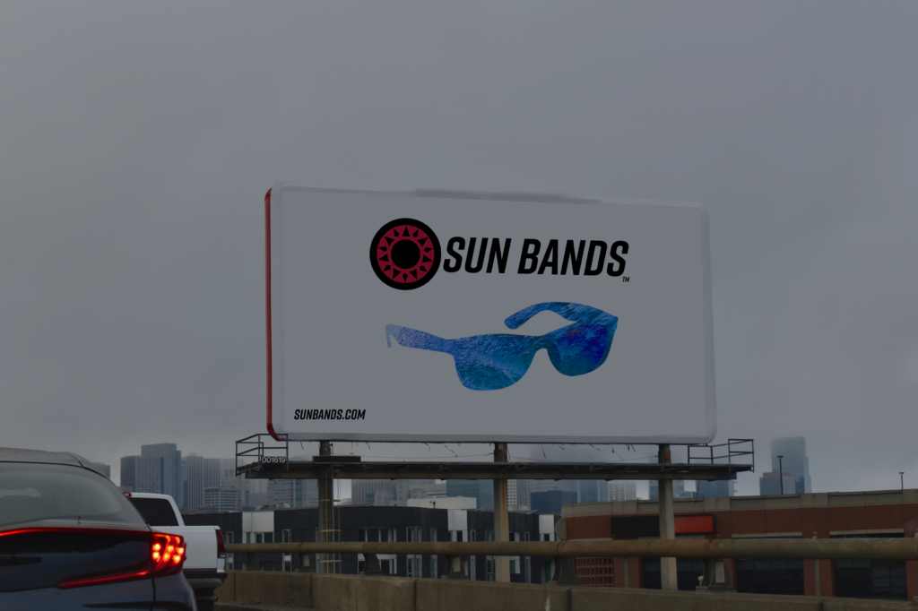
Description
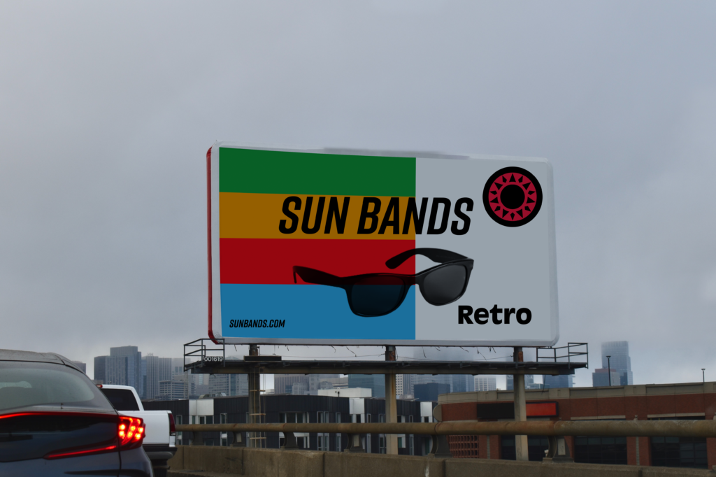
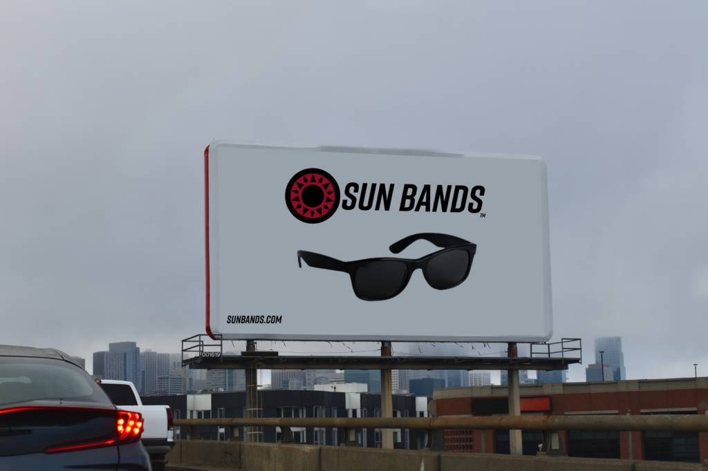
I used a pre-existing photo of a billboard, then removed the contents of the billboard, added the elements, and wrapped them to make it feel like it was on the billboard. I also added an overlay to the elements to give them some texture and feel.
I wanted the billboard to be bright and to get your attention. I think this is important to stand out from the sea of billboards.
Business Card
Description
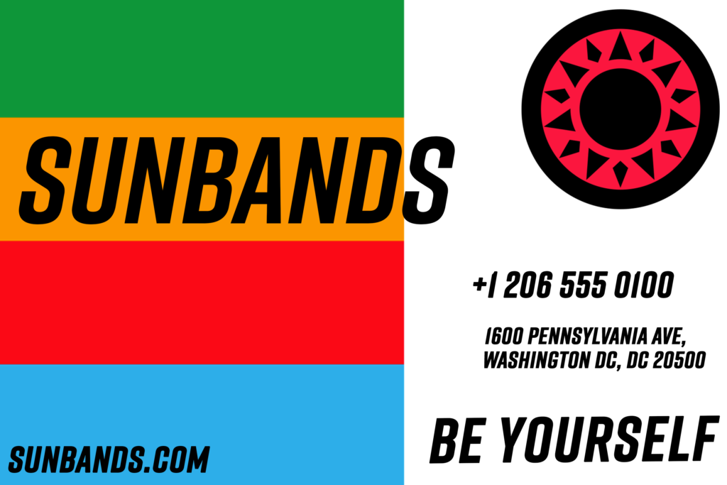
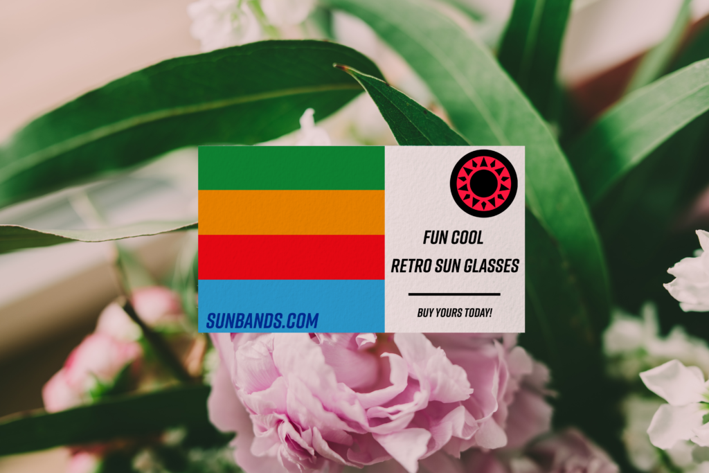
For the business cards, I wanted them to be simple but still have the required information for a business card.
I think the hardest part was trying to fit everything on the card.
Product Mock Ups
Social Media Ad
Ads
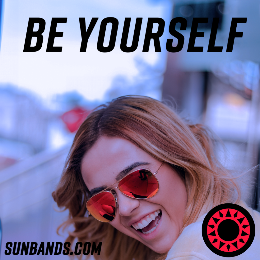
For my first iteration, I wanted the ad to be more vibrant and uplifting, to give you a sense of joy.
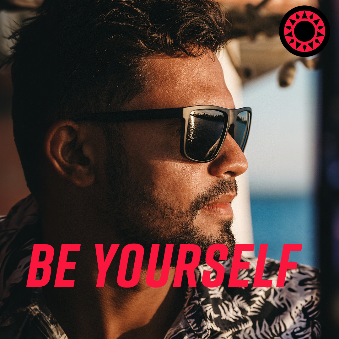
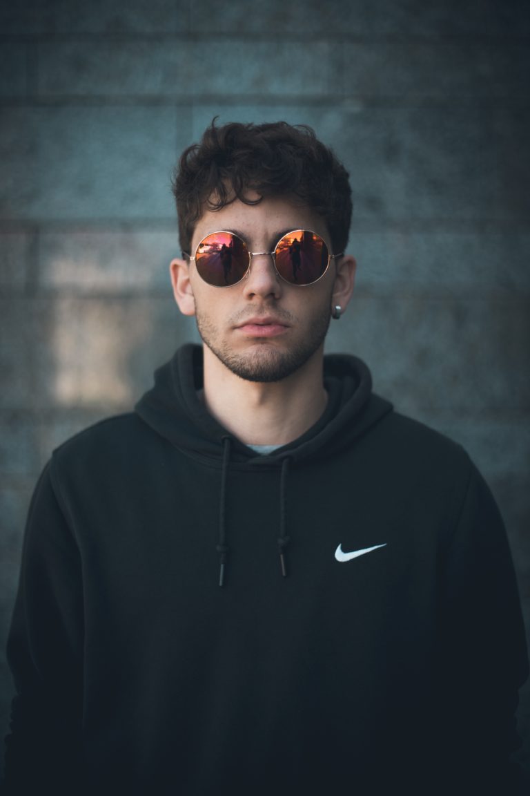
My main inspiration for this ad was men’s cologne ads.
I wanted the ad to be professional and more to the point than the first ad.
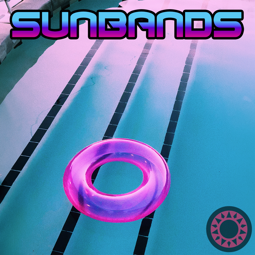
I wanted with this ad to be more vaporwave and 80s type feel to it.
Description
For the social media ads, I went with 1080×1080, which is also Instagram’s post dimensions.
I wanted every ad to have a center focus; for example, the pool ad has a float as the center of focus, this gives a music album type feel to it.
Most of the original images were too small, so I had to center them, then use Photoshop’s generative AI to fill in the rest of the image, and for the most part, it turned out pretty well and was believable.
