Business Professionals Of America 60th Anniversary Project
Overview: For this project, I created a 60th Anniversary Branding set for Business Professionals of America within a 30-hour time limit and apply them to products that they requested : Windbreaker and a Stress Ball.
Who was this for? It was designed for BPA members, including high school students, collage students, advisors, and judges
What skills did I use? I used design skills like sketching, layout, typography, color theory, logo development, mockup creations, and brand consistency. I also use photoshop and Google Slides.
1: Inspirational/ Research 1-4 hours
To start the project, I researched BPA’s brand style and looked at different anniversary logos and posters to understand what designs look clean, professional, and meaningful.
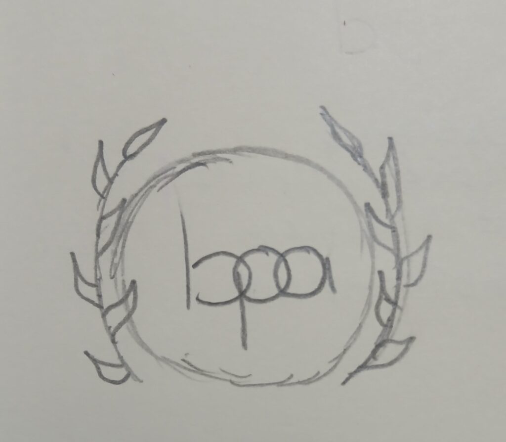
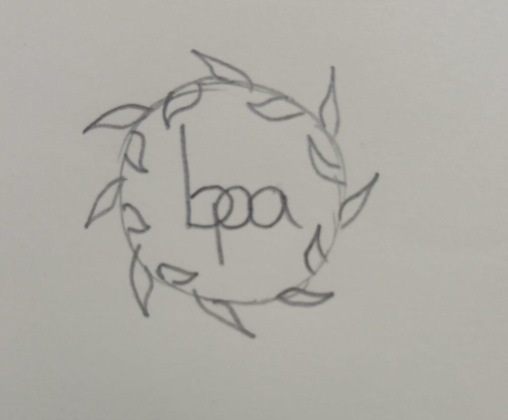
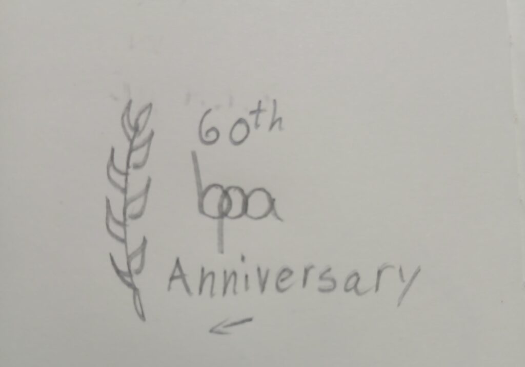
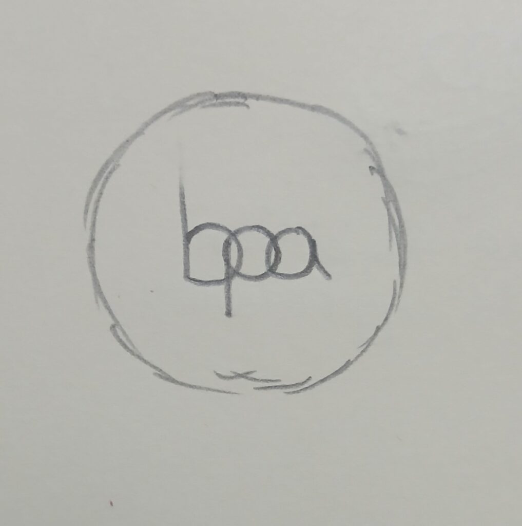
2: Sketches and connecting Next 5-8 hours
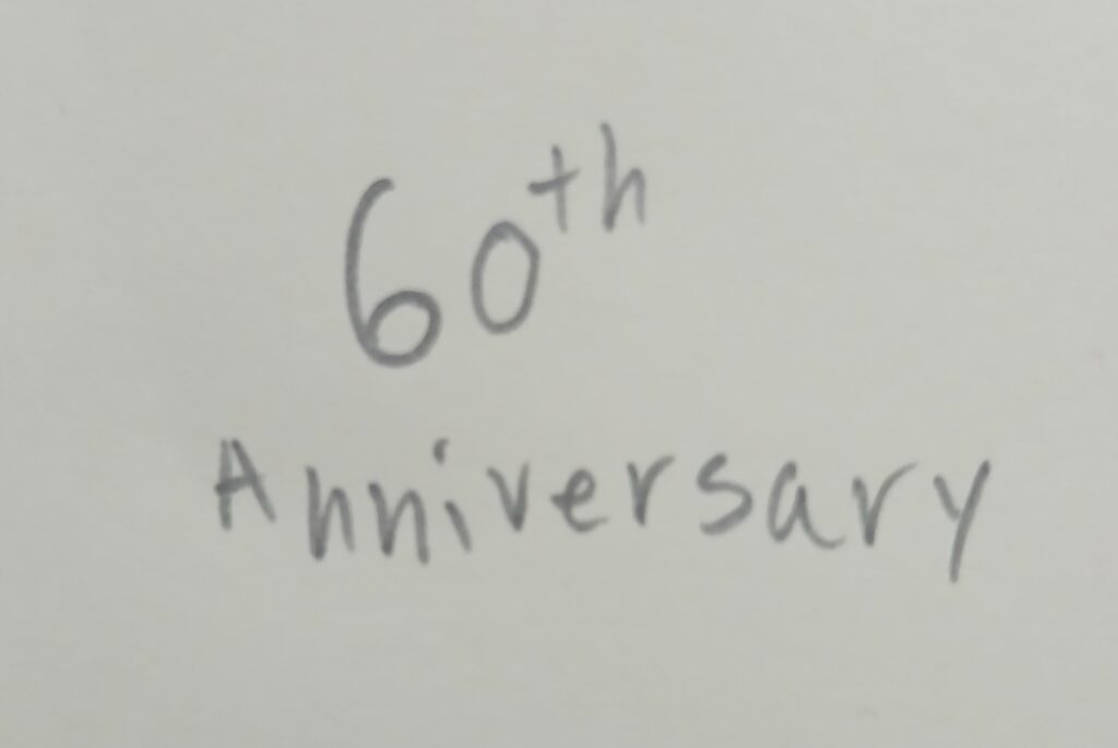
I sketched a variety of logo ideas, experimenting with shapes, symbols, and layout styles until I found the ones that best represented BPA and the 60th Anniversary theme.
3: Digital Logo Development 9-13 hours
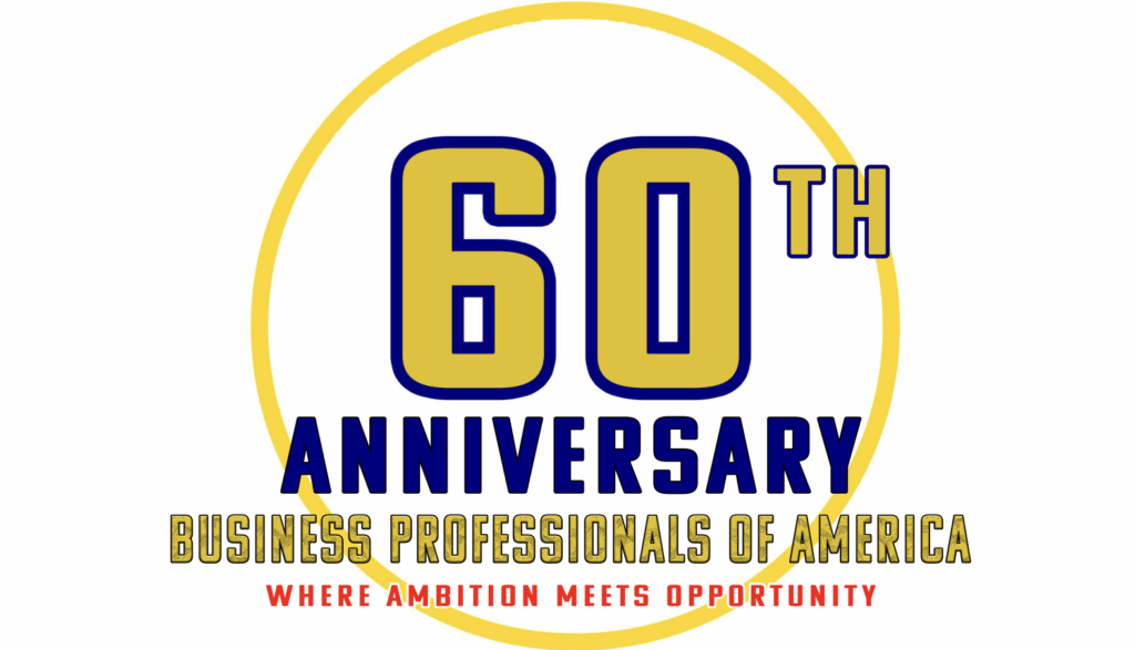
After choosing my strongest sketches, I recreated them digitally in Photoshop adjusting the lines, spacing, and shapes so the logos looked clean and professional.

4: Color Testing
I tested several color combinations and chose gold because it gives the anniversary a special, celebratory feeling, even though its not an official BPA color- it worked well with the branding.
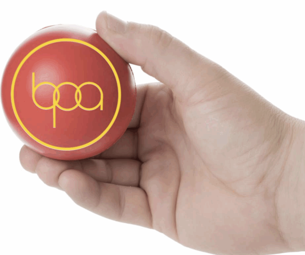
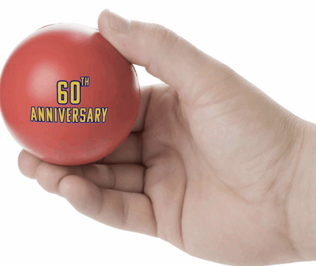
5: Product Mockups Hours 18-21
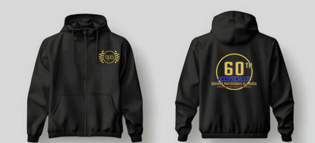
I placed the final logos onto product mockups like windbreakers and stress balls to see how they would look in real life and make sure the designs were readable, balanced, and visually appealing.
6: After seeing the mockups hours 25-27
I went back and fixed small details like alignment, spacing, and color balance to make sure everything looked consistent and professional.
7: Final Designs
These are my final designs, showing the complete branding set for BPA’s 60th Anniversary, including the finished logos and how they appear on actual merchandise.
And Presentation and this Portfolio were on hours 28- 30
My Goal was to create designs that looked professional, readable, and meaningful for BPA members while clearly showing my full design process
What challenges did I face, and how did I overcome them? One challenge was keeping my design readable while working on the anniversary color blue on the Windbreaker Logo. I solved this by testing contrast on mockups and adjusting spacing and shades. Another challenge was staying within the 30-hour limit, so I planned my process in steps and stayed organized.
If it was a team project, what role would I be and how would I contribute? I’d probably be the one in charge of the visuals. I’d handle the sketches, logo concepts, and mockups while checking in with the team to make sure everyone’s ideas fit the design.