Skip to content

skills showcase project

Overview

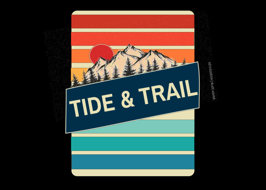
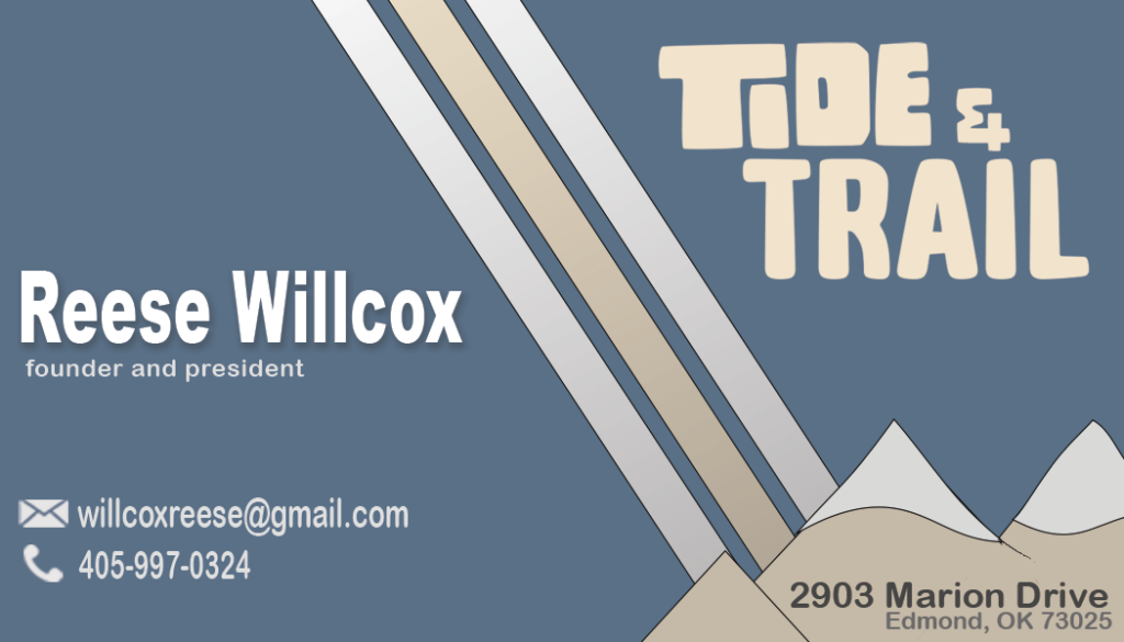
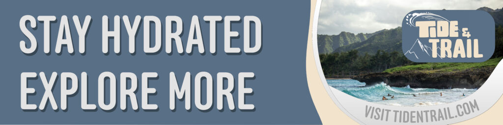
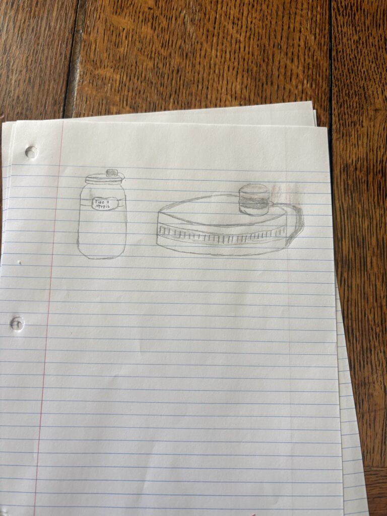
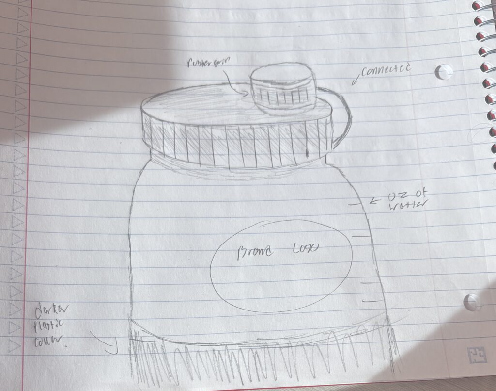
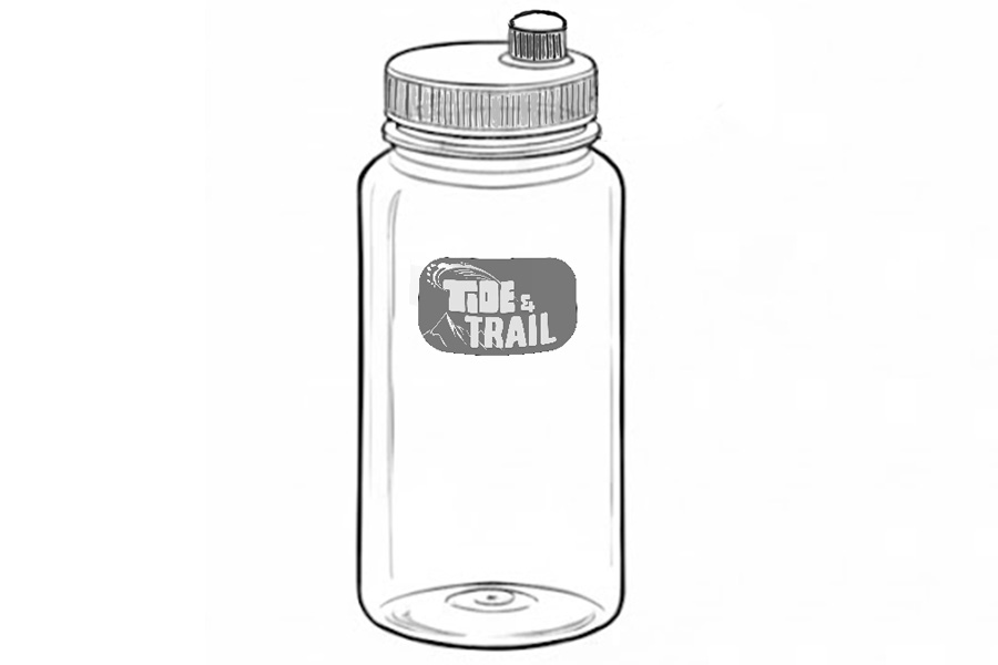
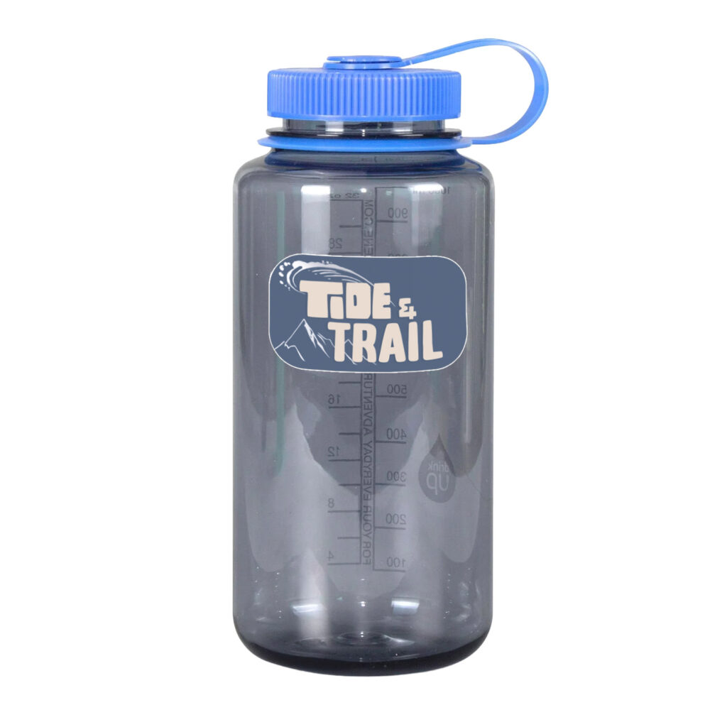
I was assigned to create and design a water bottle company in 30 hours.

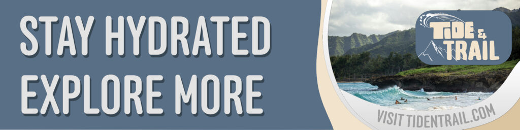
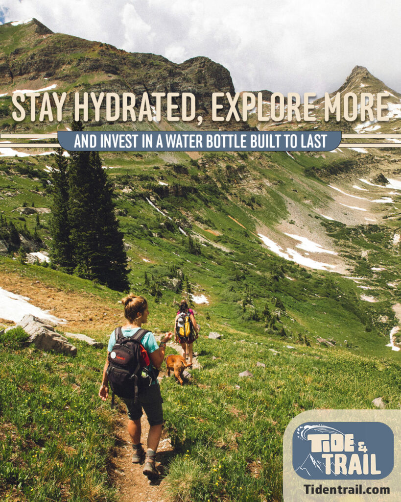
​With the following; a logo, business card, social media graphic, billboard, and product design.

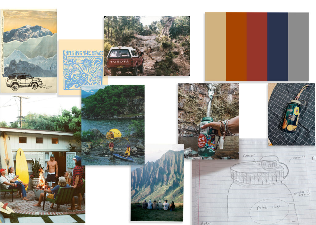
​Target audience: those who enjoy the outdoors, geared mainly toward young adults.

​The goal is to create a functional and high-quality water bottle with better branding and marketing than its competitors. I will push hard to the young adult community through platforms like Instagram and through youthful designs.

Project Plaining

I started out with researching the market as well as pulling together a mood board of designs I like.

logo

I started out experimenting with designs for the name I came up with.

To then my final logo

My goal with the logo was to choose two different fonts for the different spectrum of beach and mountains, with the tide being a more surfy and Hawaiian font, then the other one being more mountainous with also enforcing that idea with the water splash wave over the tide, and the trail having the mountain silhouette behind and to the side of the text.

I tried going for high contrast and making it simple without being bland or lifeless by adding the mountains and water splash.

Business card

My goal was to create a cense of motion through shapes and diagonal lines while still reenforcing what the brand stands for with the mountains housing the address.

Billboard

Balancing the website to flow with the rest of the design was the hardest part; but through edits and revision it got better and better.

Then to the final design. I felt that when I curved the text, it fit the flow of the billboard way more.

social media ad

I went with an Instagram graphic because of their younger demographic.

I wanted the main focal point to be the picture because that is so much of what Instagram’s themes are and what they are geared towards.

Product Design

I wanted mine to be similar to Nalgene, but I have never liked the massive cap to where drinking on the go can spill a lot, but also don’t love the tinny caps like Swell bottles that can be hard to fill in a river, so I designed a cap that had both.

My sketches lead me to a computer sketch of the product with the added  logo as well as a full color mockup using a similar bottle.