Map Level Design
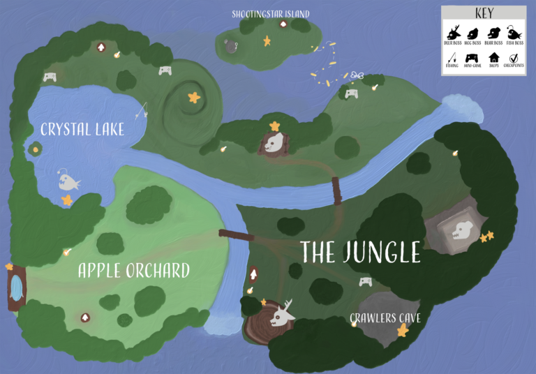
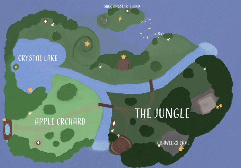
My target audience is kids and tweens, for this demographic I needed to use brighter colors as well as bigger, more playful, looking text to fit with the feel of the map. I also added a key so it makes things easier for kids to tell whats going on. Choosing this demographic led me to make a smaller, less complicated level design.
I had 30 hours to complete this project, before I started I planned out how much time I would spend on every part of the process. In the end I spent around 2 hours researching, and about 2 hours of trial and error making the maps layout and logos. The brainstorming part took around just an hour to come up with a design for the level itself.
The skills I was able to use were, my photoshop, illustrator, and fresco skills. Fresco is what I used for almost the whole map, from the sketch to the map alone it was all done there. Illustrator is what I used to make the icons for the map and map key. Photoshop was the last thing I used, using it to make the map key in the top right corner.
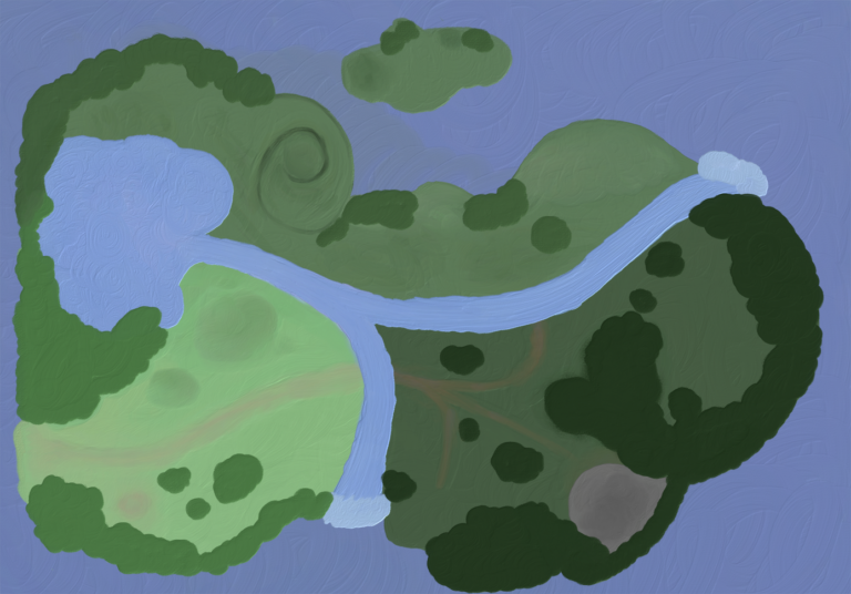
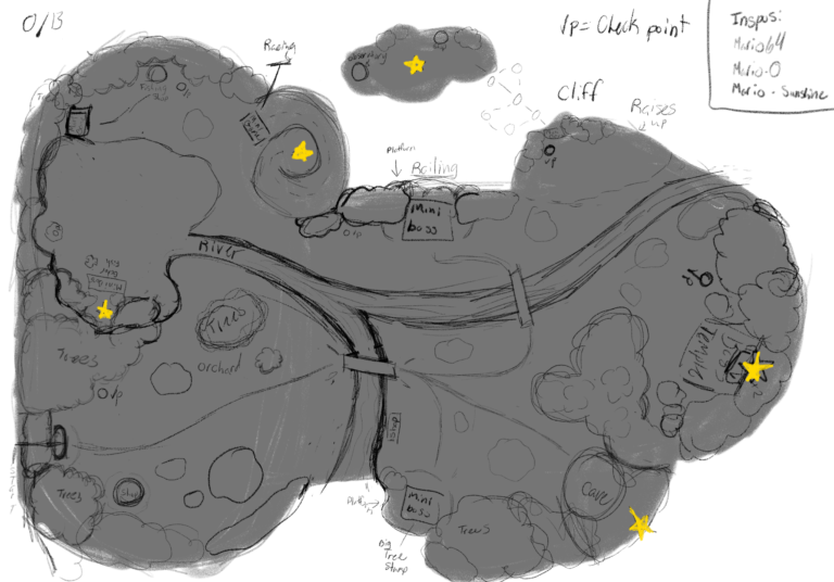
I’ve never made a map before so throughout the process I ran into some issues. I struggled for a while on the first layout of the map, constantly resizing and changing things out until I found something I was satisfied with it. Color was another struggle, finding the right shade of green for each area was a bunch of trial and error.
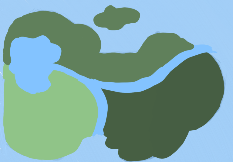
Sketches and first Ideas
Logos
These are the logos that are on the map and the map key.


My References
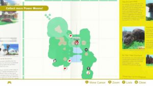
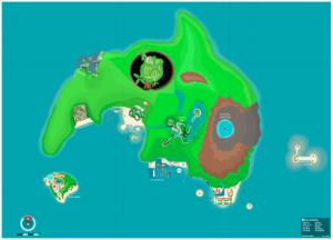
My original inspiration for my map comes from a lot of child hood games (and Mario) due to the simple imagery. Because the audience I'm making this map for is children I thought of something more simple and colorful.
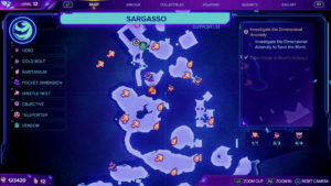
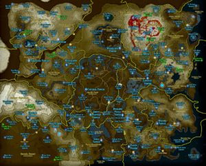
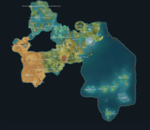
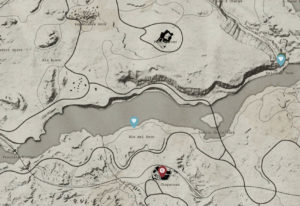
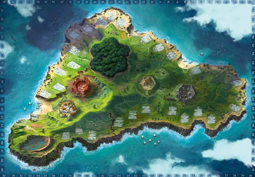
When looking at other games I decided to go for a bit more detailed of a map, so I started looking into more inspirations and games I enjoyed like Zelda, Red dead Redemption, and Genshin. Looking back at my audience I wanted to hit a good middle ground of detailed but not so detailed it looked like it belonged in a more "adult" looking game.
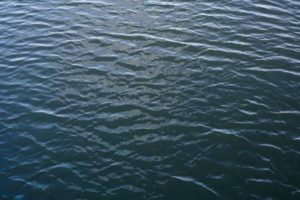
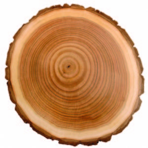
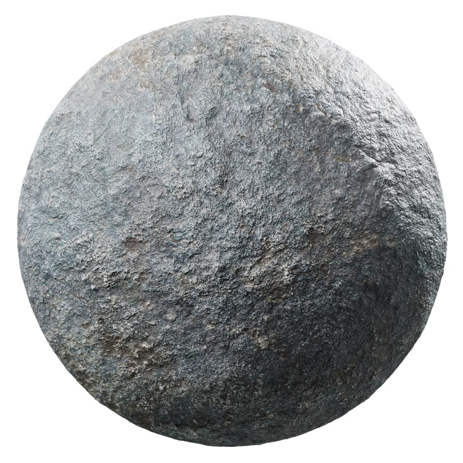
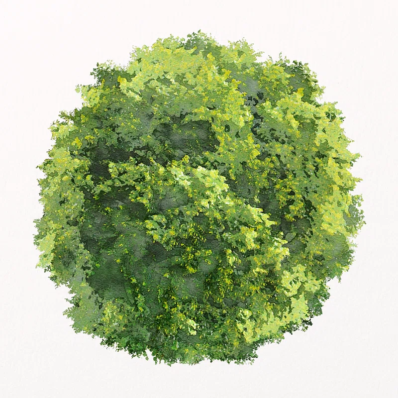
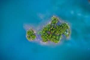
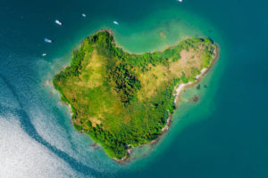
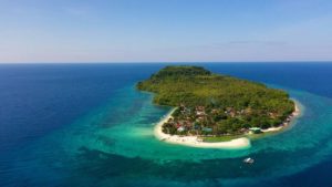
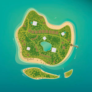
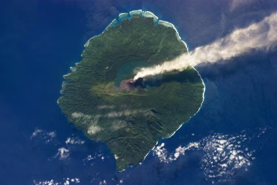
So then I went to look for resources for texture and reference. These are the images that helped me through the whole project.
