Character Turnaround
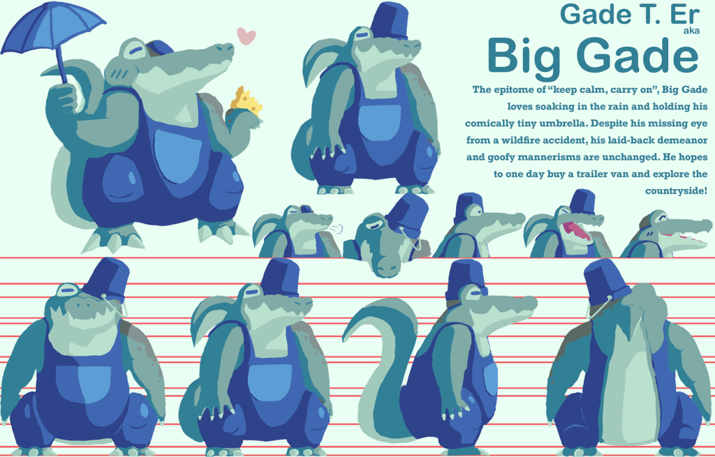
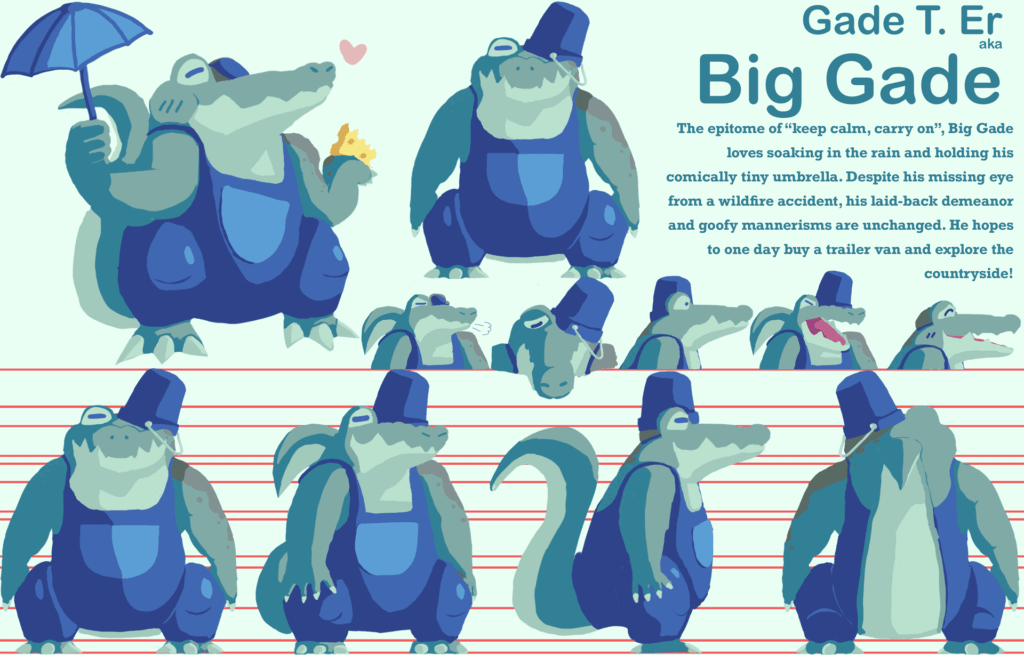
For my graphic design class at Francis Tuttle, I had the opportunity to pick from many different skill showcases. I decided to do the character turnaround, meaning I had to design a character, and then I had to design how he looks from different angles. I finished this in 30 hours, or ten part-time work days. I showcased many competencies as a result by determining an audience for my character, communicating with my clients to request feedback and ideas, exporting the correct deliverables for the project, applying basic color rules and design principles in my character sheet, and using Photoshop as my main tool to draw and edit the character and sheet!
Research & Conceptualization
When designing my character, I had to do it with this prompt:
“A cheesy alligator that loves rainy days. They want to live in a van but are afraid of fire.”
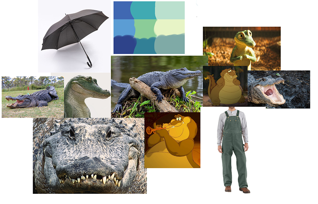
I noticed that someone else used the same prompt to design another character, and I was very inspired, so I decided to do the same. I also actually used some of their moodboard but edited it to include different design elements.
Most of my character inspo comes from Louise from The Princess and the Frog. I also took much inspo from certain reptilian Pokémon like Krookodile and most notably Aggron. I found their character designs very interesting and decided to pull some ideas from them.
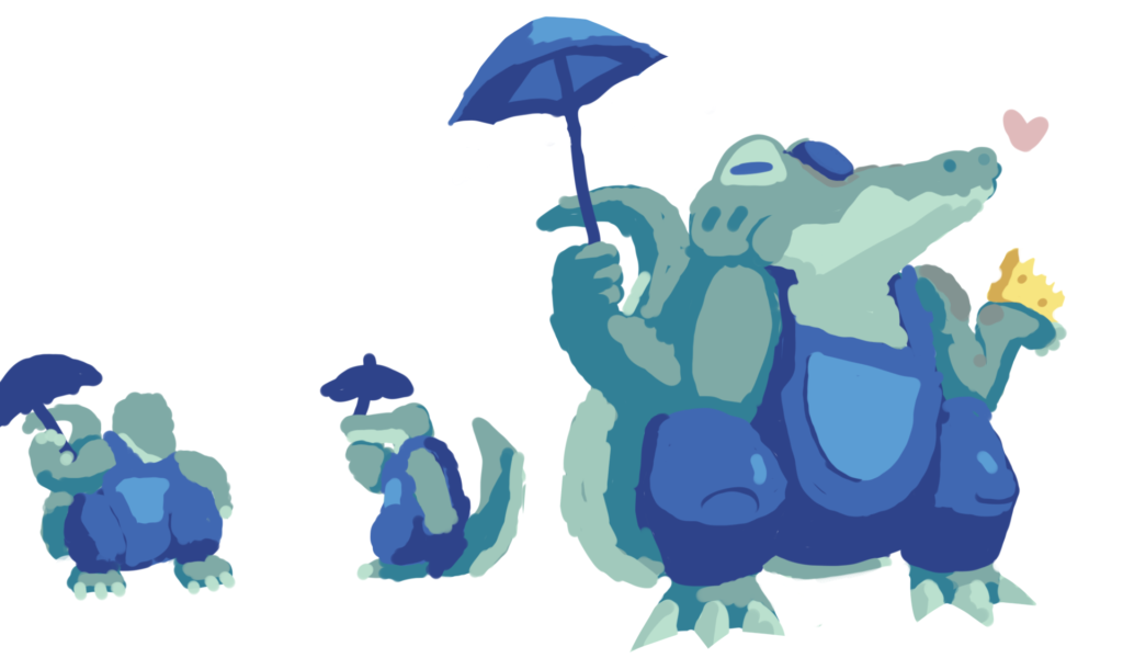
I came up with my first sketch by first blotting down rough colors. Unlike most character designs, Big Gade was constructed without an outline. This allows me to come up with forms more easily, but it sometimes makes them harder to define, especially if two forms are the same color. After some rough tests from different angles, I finally came up with a bigger rough sketch. You can see how his right arm is hard to tell apart from the back of his tail in the completed sketch. Is it really a sketch if there’s no lineart? … Good question.
I used an analogous color palette of green-teal-blue to give the character an overall ‘cool’ appearance, reflecting his love of rainy days, which are also usually associated with those colors. His tiny umbrella is way too small for his head, but he likes carrying it around to make others laugh. He’s wearing an eyepatch and has gray burn marks on his skin because he got injured during a wildfire accident, which has since given him an intense pyrophobia. His overalls reflect his ideal love for van life and the overall countryside.
After coming up with a sketch, it was time to come up with the other angles.
Sketches
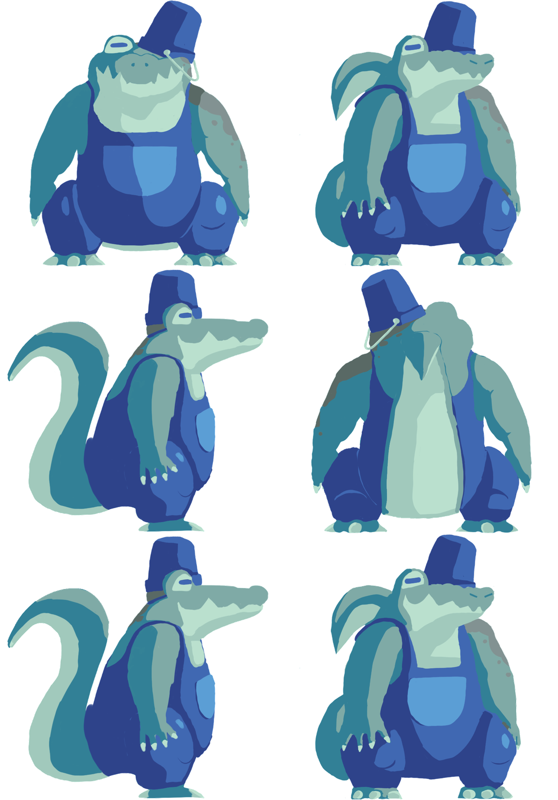
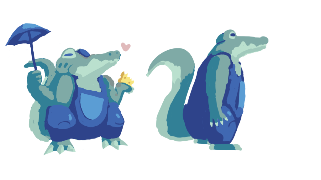
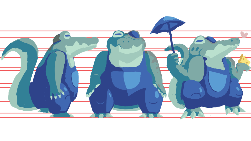
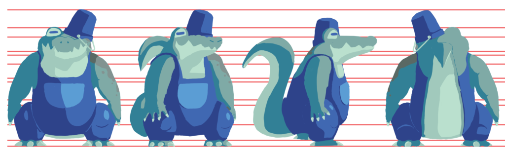
After creating the relaxed pose, I created a sketch for the side. The initial sketch was a bit too tall, so I shortened it in the one below. I also began using line guides to help me keep proportions consistent from angle to angle.
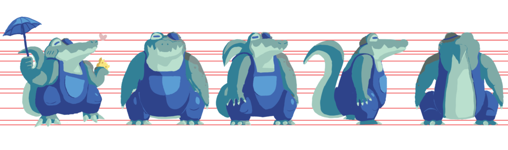
After the side, I drew the front, which I admittedly had a very hard time getting right. I struggled with drawing the arms and torso proportions right, and to this day I still feel like his front view reads more like a frog than an alligator.
Drawing characters with long snouts facing forward never goes well. In my experience, with one of my favorite characters having a long snout, any pictures of them facing forward, whether it be a drawing or a 3D render, look very derpy. With a character that has a snout as long as that one, a goofy-looking front profile was inevitable.
After the front view was the 3/4 view, which was admittedly way easier. Looking back, I think I made the front view’s head too wide, which could explain why it looks more like a frog. Then again, alligators have winder snouts than. crocodiles, and I didn’t want to risk it reading incorrectly.
After fixing up the front view a bit, I eventually did the back, which was surprisingly easy. All I had to do was take the silhouette of the front view and flip it, making adjustments accordingly. I think if it weren’t for the tail, people would immediately assume it’s a frog. Unfortunately, I had no clue how to make it read better at the time.
Throughout this process, I think one thing I could have done better was adjust the front facing snout to be less wide but also a bit higher up. In the turning gif, the front facing nose is lower than the other views, which makes it look out of place. If I ever do another character turnaround in the future, I’ll be sure to keep an eye out for that.
Expressions
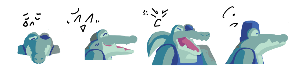
This was the most fun part! It was very fun to manipulate expressions into an alligator face. The character almost always has their eyes closed, sort of like Brock from the Pokémon anime. They only fully open their eyes when they’re shocked. It was very difficult for me to draw the mouth open on the 3/4 view, and I had to invent an entirely new perspective for the sad expression, but I say it’s worth it because it gives him so much more character.
Later in production, one of my other graphic design friends had the idea of giving him a beach pail on his head rather than an eyepatch. I decided to keep the eyepatch but just hide it under his pail for more formal occasions. The same friend actually came up with another expression that appears in the final character sheet!
Final Product & Reflection
While I am very, very fond of the final product, I will admit that it has some flaws. The front view still bugs me to this day. I bet if I showed someone the front or back view of my character without any other details, they would say it’s a frog with a tail. I just wish there was another way I could make his “alligatorness” more readable. Also, the eyes in the relaxed pose bug me a bit, but I can’t figure out why. It might be the cheek since he’s chewing in that pose. Not sure.
This project helped bring me out of my comfort zone and teach me about the many ups and downs of character design! If I had to do this again, I definitely would. Coming up with a story and name for this character was so much fun, and excluding the criticism above, I don’t think I’d want him any other way.