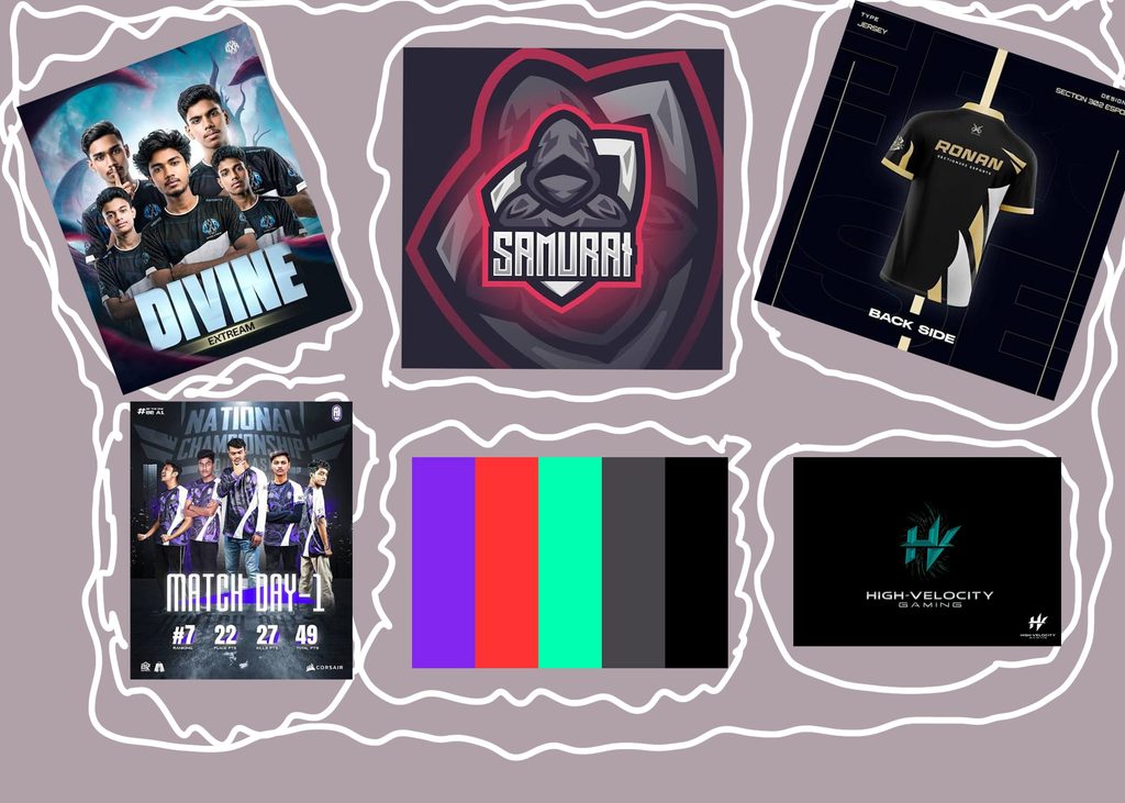
this is my mood board!
Mood Board
For my mood board, I collected different esports logos, team jerseys, team posters, and color ideas for inspiration. I wanted to see how other teams used their logos, colors, and designs to make their brands stand out. I also included a color palette with purple, red, teal, gray, and black while exploring different looks. Looking at these examples helped me get ideas for my own OVERDRIVE E-SPORTS brand. I ended up choosing a racing theme with red, white, black, and gray because I liked how those colors looked together and felt they fit my idea better.
LOGO
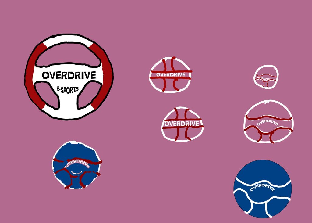
For my logo, I made a steering wheel with OVERDRIVE E-SPORTS in the middle. I chose the steering wheel because I wanted the racing theme to be clear right away. I used red, white, and black to make it stand out. I wanted the logo to be simple enough to recognize but still have its own style.
JERSEY DESIGN
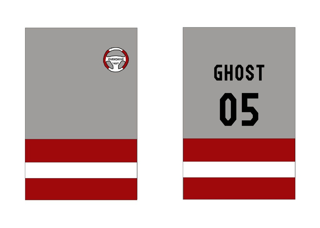
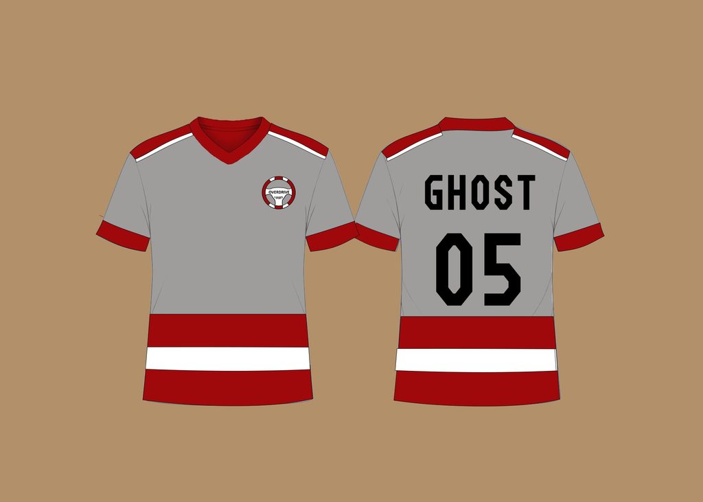
For my jersey, I used gray as the main color with red and white accents. I put my team logo on the front and GHOST with the number 05 on the back. I wanted it to look like a real esports racing jersey instead of just a regular shirt. I also kept the colors consistent with my logo so everything matched.
PROMOTIONAL POSTER
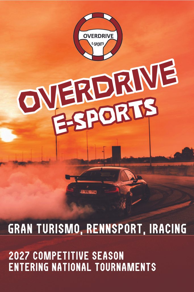
For my poster, I used a picture of a car drifting with smoke behind it. I chose this image because I liked how it looked and thought it fit my racing theme really well. I made OVERDRIVE E-SPORTS large with red and white lettering and outlines so it would stand out. I added the 2027 competitive season and national tournament announcement at the bottom. I wanted the poster to look exciting and make the team feel like a real esports organization.
BRANDING BOARD
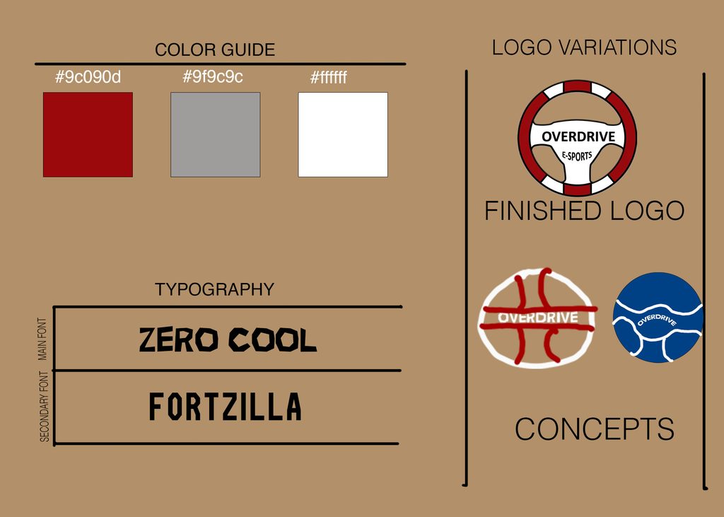
I wanted OVERDRIVE E-SPORTS to have a consistent look across all my designs. I used red, white, black, and gray as my main colors and chose bold fonts that fit the racing style. I carried the same colors and logo into the jersey and poster so everything looked connected. I chose the car racing theme myself because it was something I wanted to design, and I enjoyed building the different parts of the brand around it.
FINAL CHANGES
Final Changes
While working on the poster, I adjusted the text outlines, spacing, and layout to make everything easier to read. I also tried to keep the colors and fonts consistent across all three designs so they looked like they belonged to the same team.
What I Learned
I learned how important it is to keep the same colors, fonts, and style when creating different designs for one brand. I also got more practice using Photoshop and learned how outlines, text placement, and contrast can make a design stand out more.
Overall, I enjoyed getting to choose my own theme and build the whole team brand around it. I wanted to make something that looked like a real racing esports team, and I think using the same style across the logo, jersey, and poster helped bring everything together.